WizeCare is a clinical technology platform designed to bring physical therapy into the home environment. It empowers healthcare providers to deliver personalized, remote therapy sessions, making treatment more accessible for patients.
The Context
As a UX/UI Designer, I was tasked with redesigning the therapist's core workspace. The original platform had the right clinical tools, but the interface was too complex for a high-pressure clinic environment, leading to low adoption rates among busy physiotherapists
The Challenge
Physical therapists are experts in manual, tactile routines. Moving them to a digital solution required more than just "good UI"—it required a market education strategy. We had to prove that the software was a time-saver, not a time-waster.
Project Overview
By visiting clinics and analyzing support tickets, I mapped out the three primary barriers preventing therapists from using the tool:
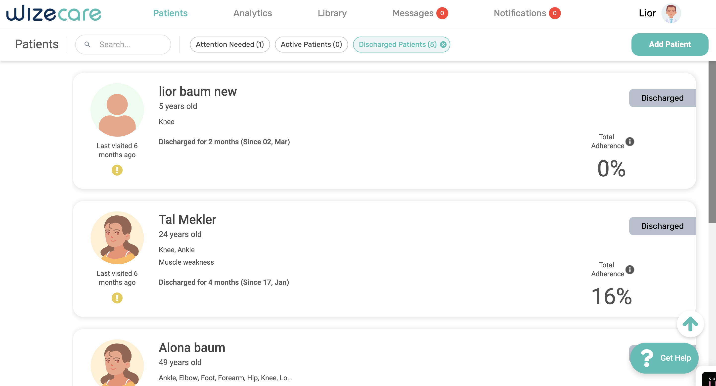
Information Density
Crucial patient adherence metrics were buried under oversized, non-functional tabs.
Workflow Fragmentation
Editing a care plan required navigating through 4-5 different screens, causing "cognitive fatigue.
Rigid Systems
The platform lacked a "blank canvas" for senior therapists who wanted to build expert protocols from scratch.
Research & Discovery
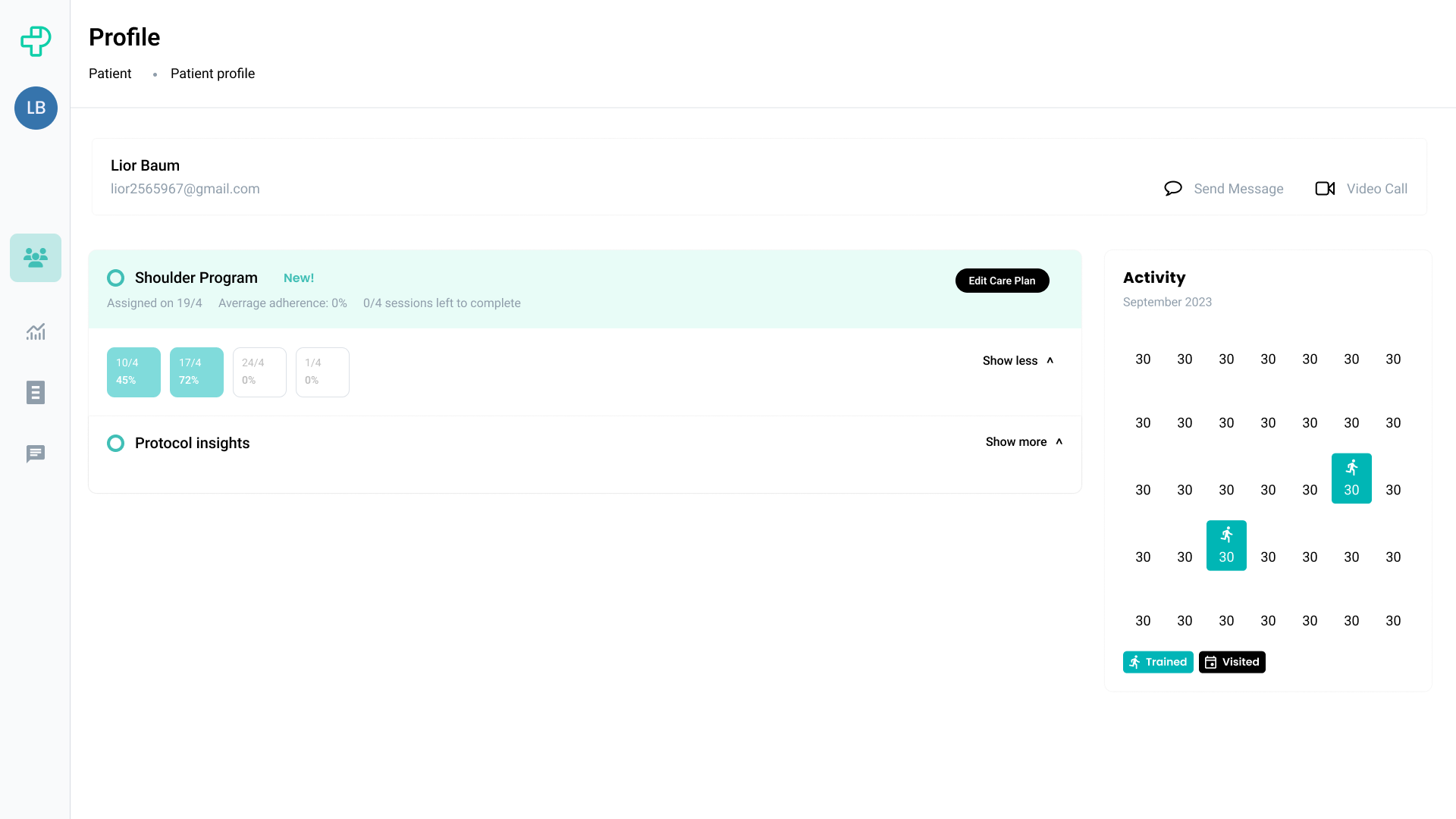
Flow 1: Monitoring & Editing
Goal: Eliminate context-switching by moving from "Insight" to "Action" on one screen.
The Problem
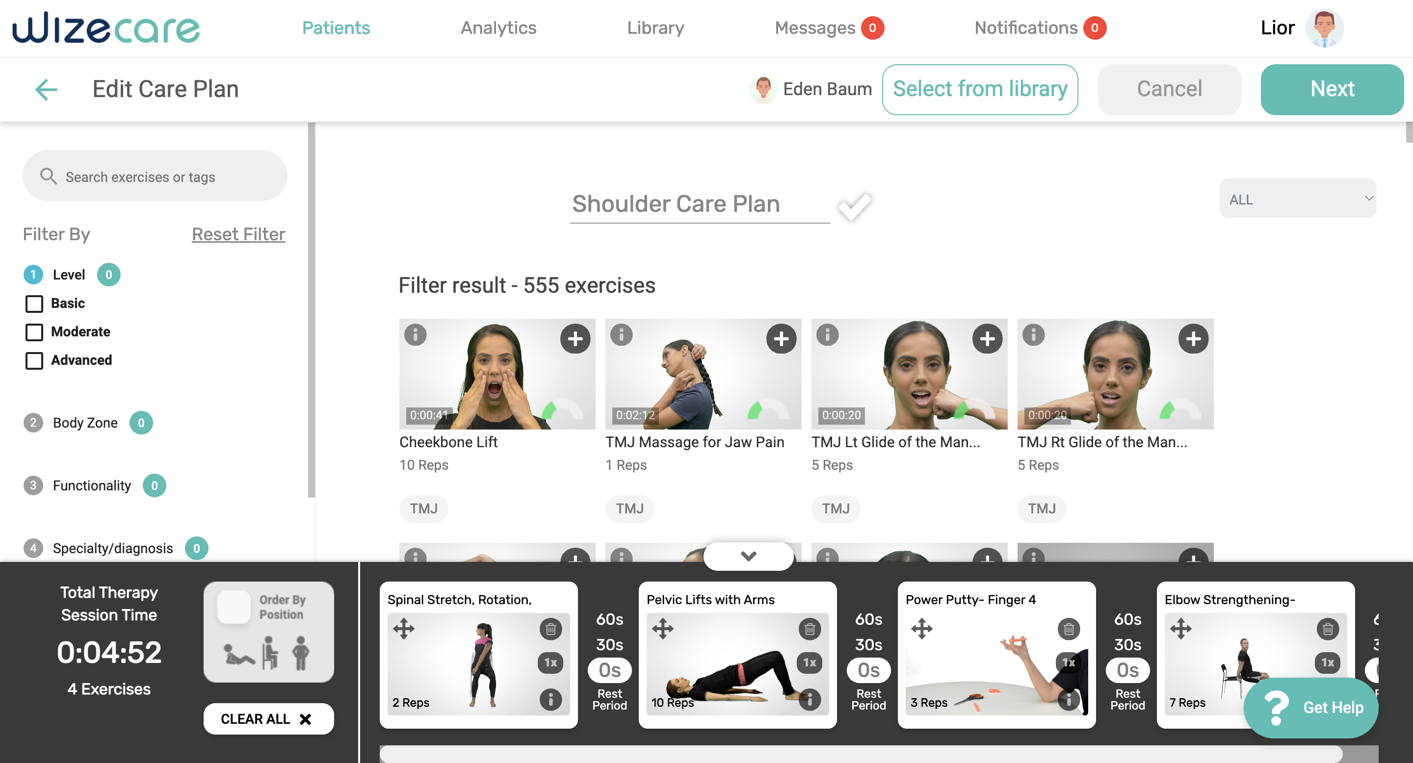
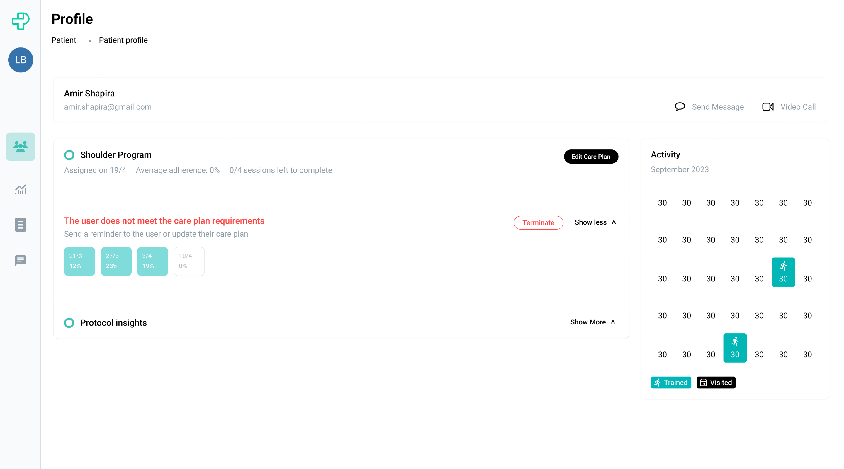
In the old app, checking a patient’s progress and updating their treatment felt like "two different worlds." Doctors had to look at health data on one screen, then jump through five different pages just to reach the Edit Care Plan area. By the time they got there, they’d lose their train of thought and forget exactly what they needed to change. The actual editing was done in a cluttered list that made it easy to misread reps or sets.
The Solution
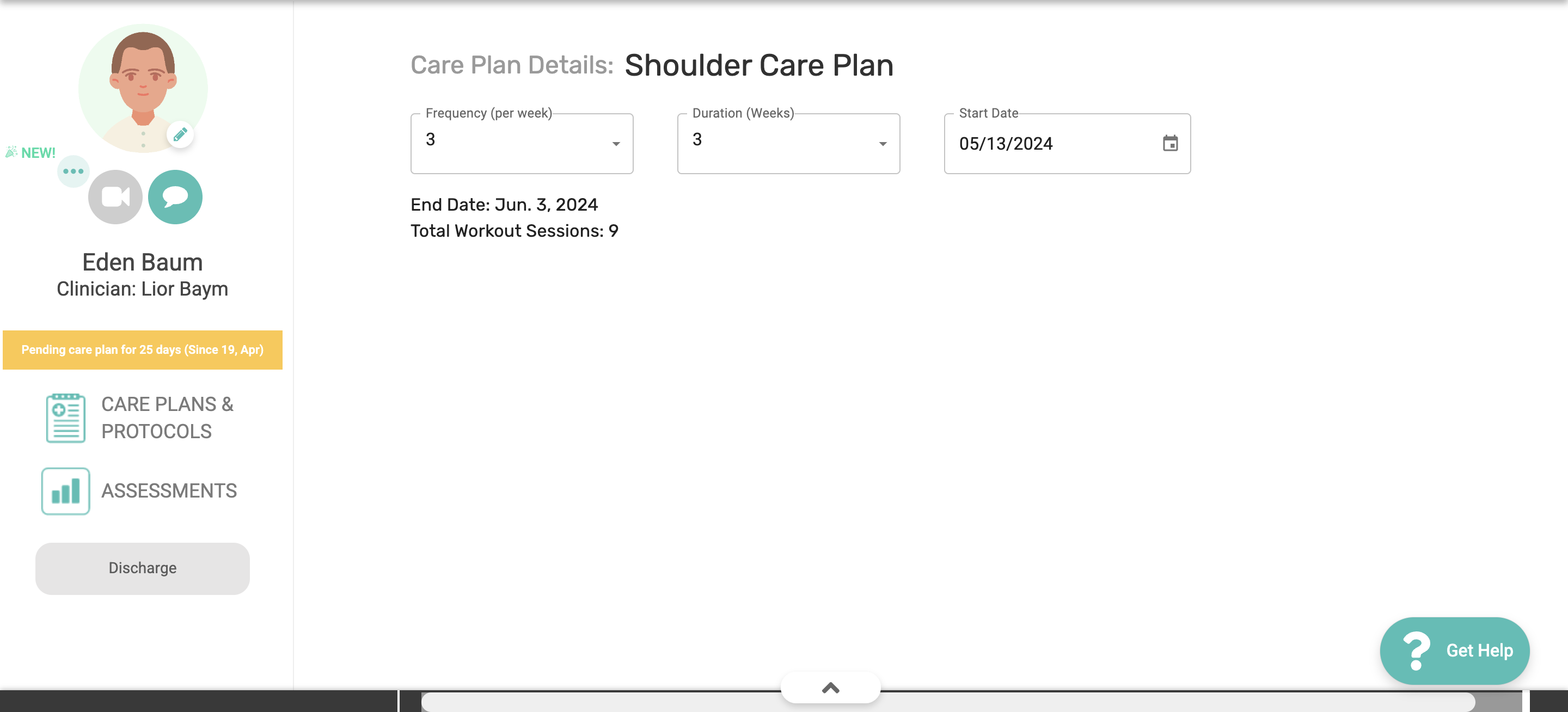
Put everything onto one focused screen. I pinned the patient’s health stats to the top so they are always visible as a reference. I then turned the Care Plan Editor into a system of "Cards" with inline editing. Instead of opening new windows or modals, therapists just click a card and type the new reps or sets right there. It makes updating a plan as fast and natural .
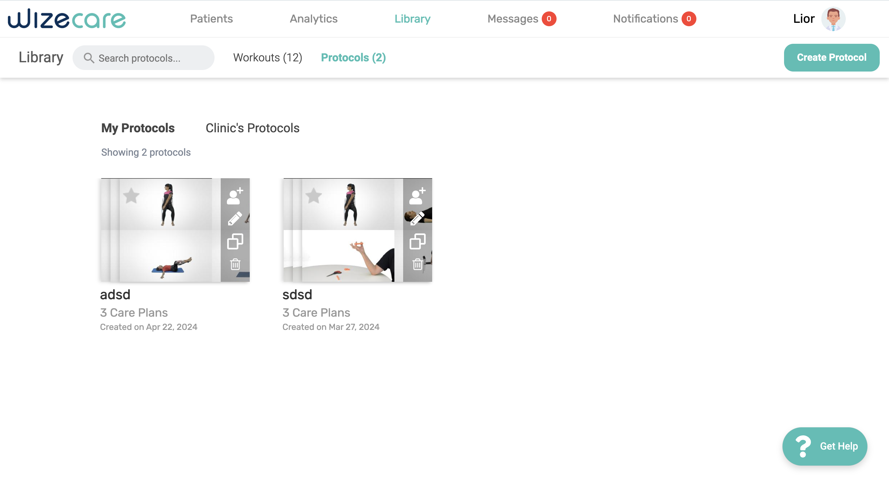
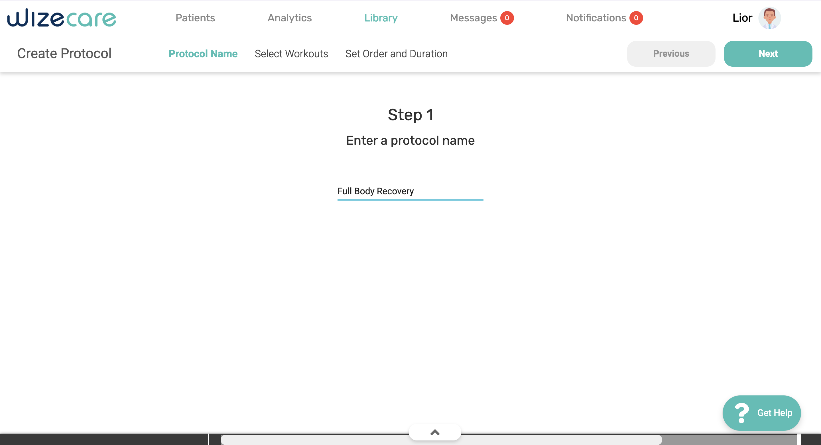
Flow 2: The Kanban Protocol Builder
Using a "Drag-and-Drop" board to build custom plans.
The Problem
Experienced doctors felt stuck. The app forced them to use basic templates, but they needed to build special, "from scratch" plans for patients with complex injuries. Without a flexible way to build these, they spent more time fighting the software than actually designing the treatment.
The Solution
I built a builder based on the Kanban Method. The exercise library is on the left (the backlog), and the patient's plan is on the right (the board). Doctors can simply drag an exercise from the library and drop it into the plan. It’s visual, tactile, and allows them to map out different stages of recovery side-by-side. Since it uses the same cards as the editor, they already know how to use it.
Outcomes & Learnings
Faster Workflows:
Therapists reported saving roughly 10–15 minutes per patient when updating plans, giving them more time to focus on actual treatment.
Higher Clinical Accuracy
By moving to the clear "Card" system, misclicks and prescription errors (like wrong reps or sets) dropped significantly.
Increased Daily Usage
Doctors who previously abandoned the app out of frustration started using it as their primary daily tool for patient management.
Scalable Design
The new modular card system allows the company to add new medical features in the future without making the app feel cluttered or messy again.