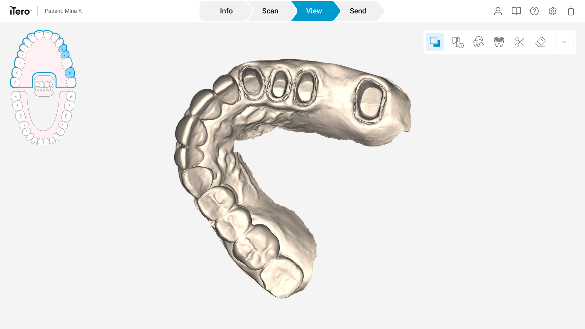
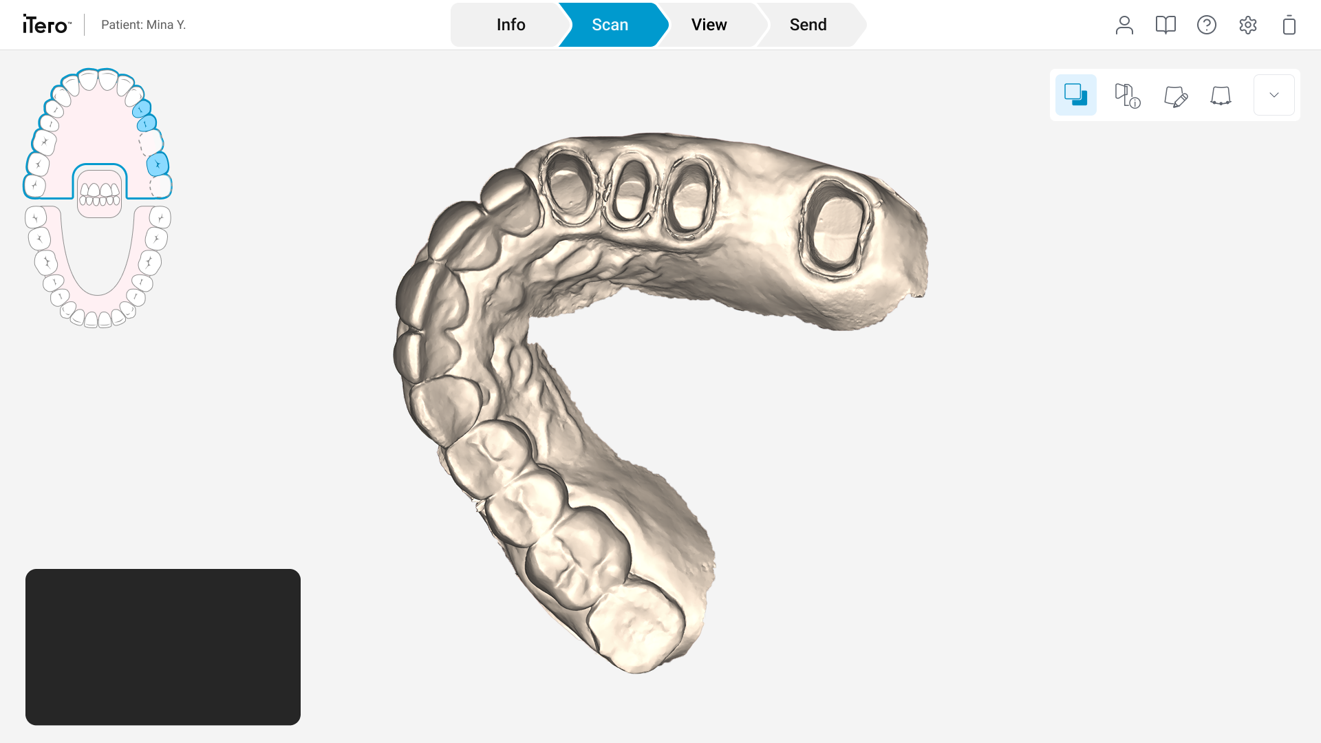
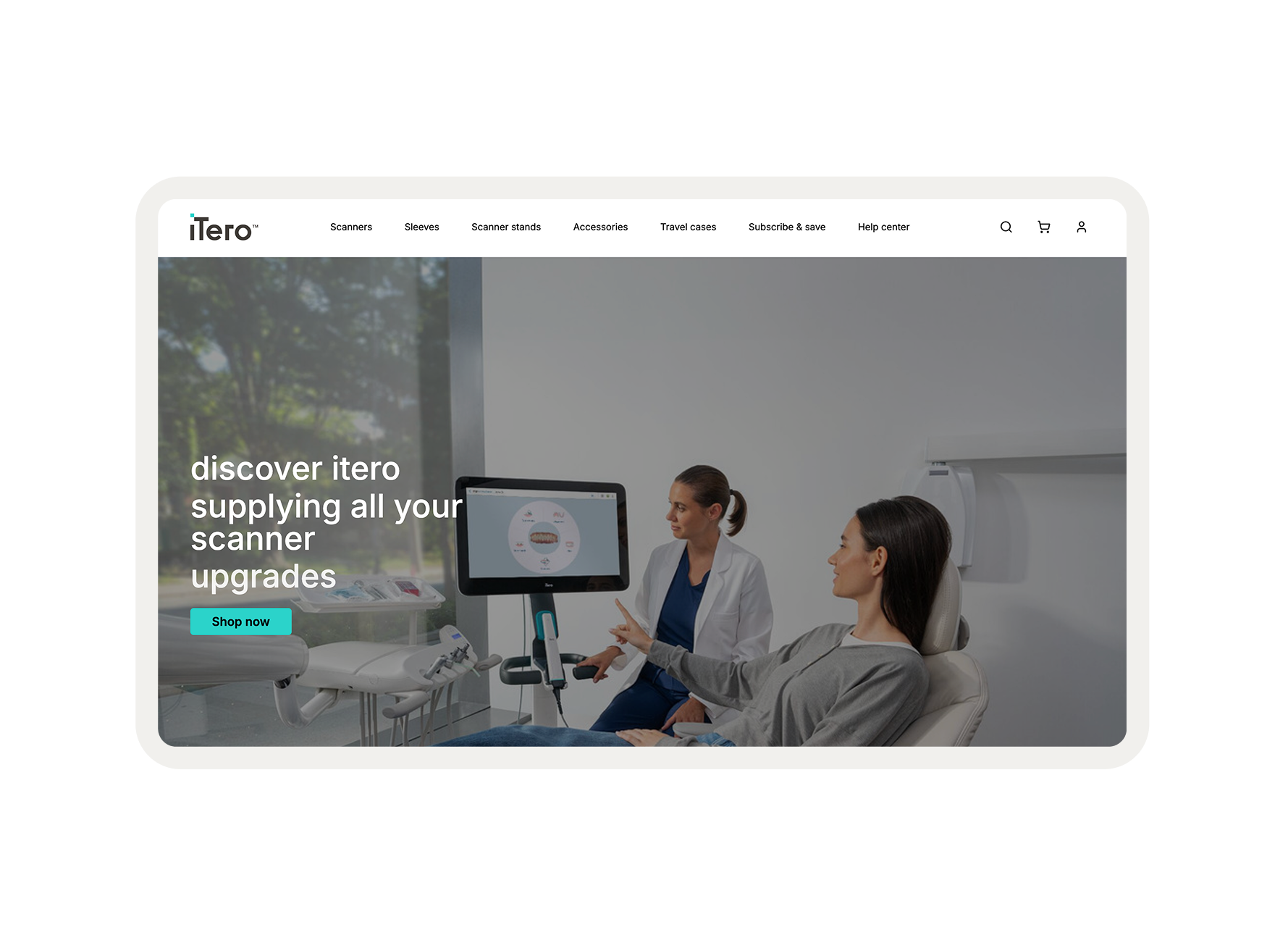
The iTero™ Scan Page is the primary workspace for clinicians performing real-time digital dental scans. Over years of development, new features were added incrementally, leading to a fragmented interface that hindered clinical efficiency. The project focused on a comprehensive UI refresh and UX implementation to streamline the scan and view processes.
Overview
The existing interface suffered from "feature creep," resulting in three core issues.
Scattered Actions
Tools were trapped in floating overlays or hidden in disparate menus.
Visual Chaos
Inconsistent icon weights and styles created a fragmented, unprofessional aesthetic.
Workflow Friction
Clinicians lost valuable seconds searching for essential tools (Eraser, Margin Line) while the patient was in the chair.
Problem Statement
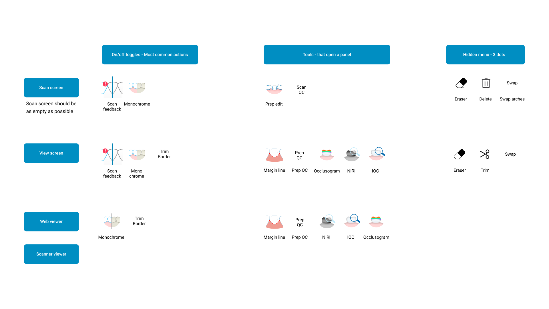
The process began with a comprehensive Tool Audit. I mapped every action across three distinct environments: the Scan Screen, View Screen, and Web Viewer.
Key Insights
Functional Disconnect
Visualizing an entire conversation at once is overwhelming; users need specific "entry points" to filter data.
Visual Inconsistency
A visualization is only effective if the user can see the "why" behind it. Linking the transcript directly to the generative form is essential.
Space Inefficiency
Clinical charts feel too detached for emotions. ASCII was chosen to provide a "digital-organic" texture that feels both analytical and expressive.
User Research & Audit
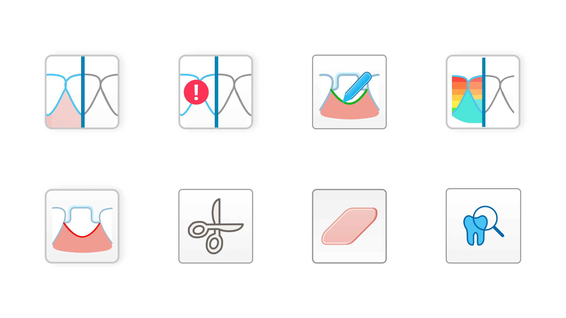
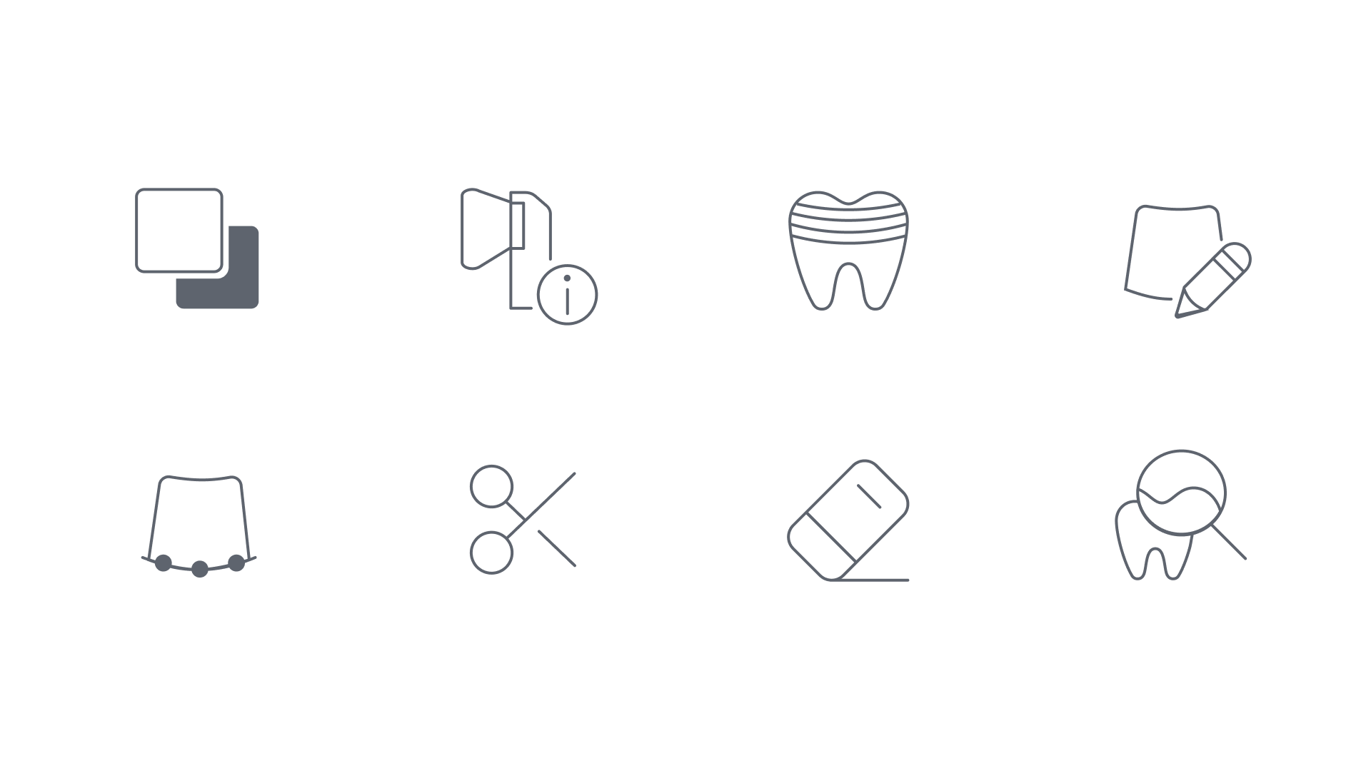
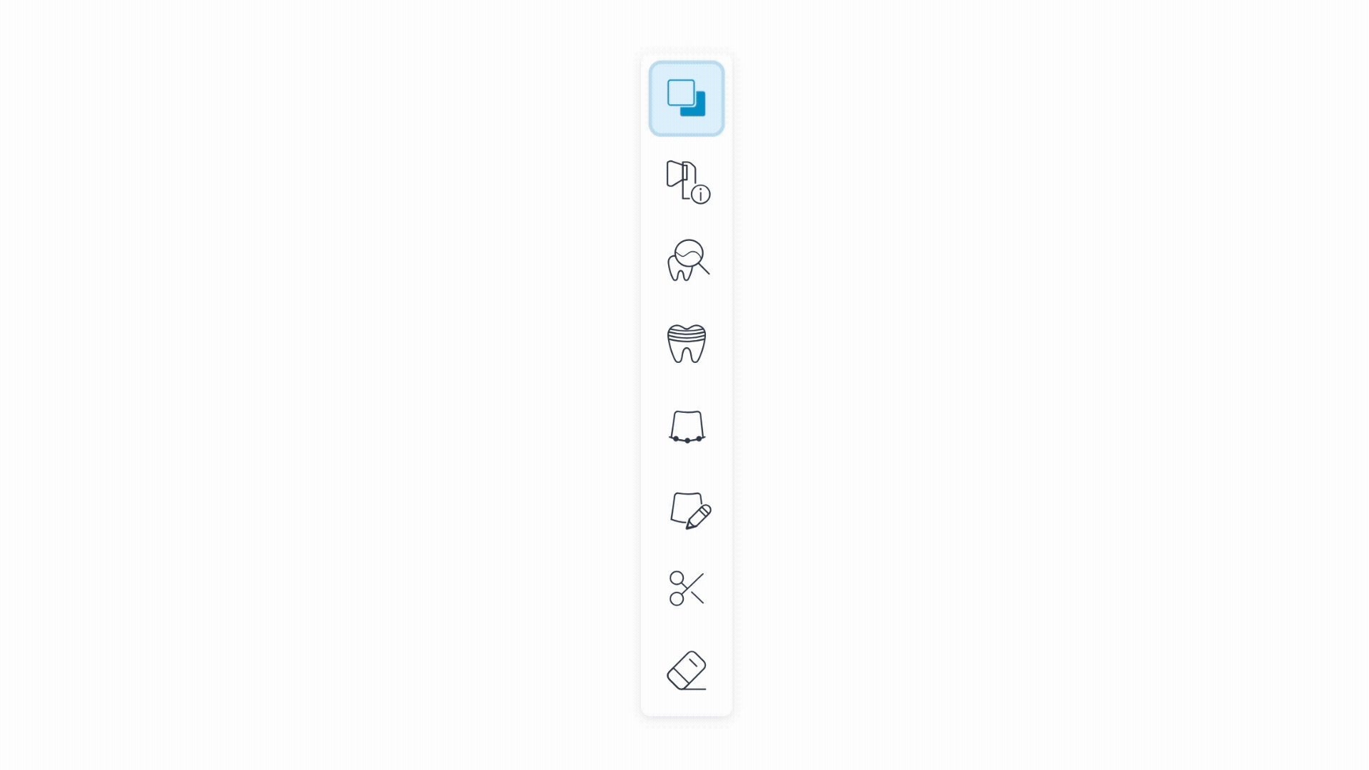
To resolve the visual chaos, I developed a standardized icon system aligned with the New Align Design System. This move ensured that the software felt like a single, cohesive product.
Standardized Grid
Every icon was rebuilt on a 60px grid for optical balance.
Unified Stroke
Established a consistent 2px stroke weight across the entire library.
High-Contrast Optimization
Refined the visual weight to ensure icons remained legible against both dark and bright 3D backgrounds.
The Visual System: Iconography
A critical decision point was determining the toolbar's orientation. We moved beyond assumptions by prototyping and testing two distinct layouts with clinicians.
Vertical vs. Horizontal Testing:
Option A (Vertical
Failed. It consumed horizontal screen real estate essential for the 3D model and felt disconnected from the natural workflow.
Option B (Horizontal) Winner
This layout maximized the vertical view of the scan and followed a logical left-to-right progression (Scan → View → Edit).
Result
7 out of 10 doctors preferred the horizontal bottom placement for its ergonomic and spatial efficiency.
Design Iteration & Testing
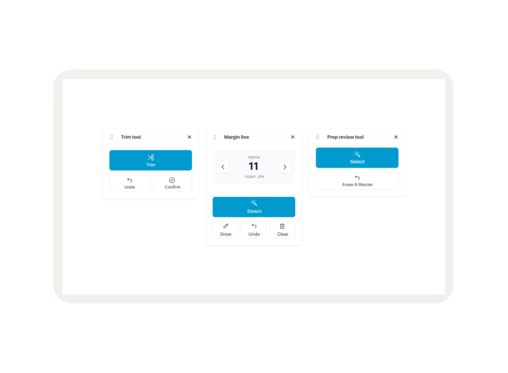
While the horizontal layout was a clear winner, testing revealed that the growing number of features made icons alone difficult to distinguish. Clinicians requested the option to display tool names to ensure accuracy during high-speed scans.
Customizable Workspace
To address feature density, the toolbar was engineered as a state-aware component with user-defined settings:
Collapsed Mode
A minimalist, icon-only view used by expert clinicians to preserve maximum screen space for the 3D scan.
Expanded Mode
An interactive state that reveals clear text labels (e.g., "Eraser," "Margin Line," "Review Tool").
Expandable Label System
The final solution centers on a Unified Horizontal Toolbar that remains persistent across all modes, reducing the cognitive load on the clinician.
The Scan Page
Tools are anchored at the bottom, grouped by logical dependency. This preserves maximum vertical space for the 3D model, ensuring the clinician's focus remains on the patient's scan.
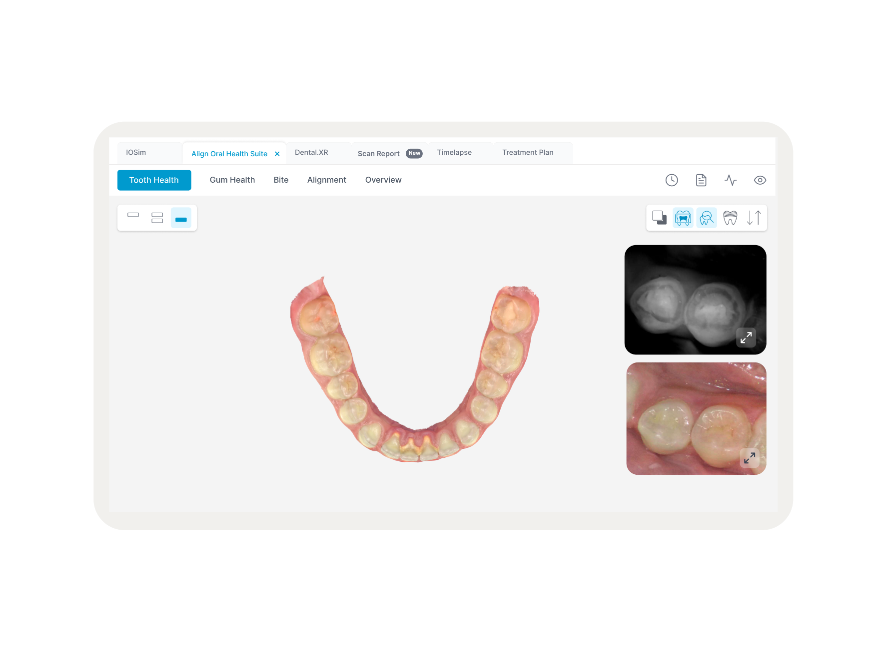
The View & Edit Pages
Consistency is maintained across modes. By keeping the toolbar in the exact same location with the same visual language, we eliminated the need for users to "re-learn" the interface when switching tasks.
Interface: The Unified Solution
Outcomes & Learnings
28% Faster Selection
Tool selection speed improved significantly due to the predictable horizontal layout.
Error Reduction
Standardized 60px click targets led to a measurable decrease in misclicks during procedures.
Enhanced Visibility
The optimized layout exposed more of the 3D scan area, improving the overall clinical utility of the software.
Systemic Scalability
The new toolbar and icon system provide a robust framework for adding future features without creating further visual clutter.