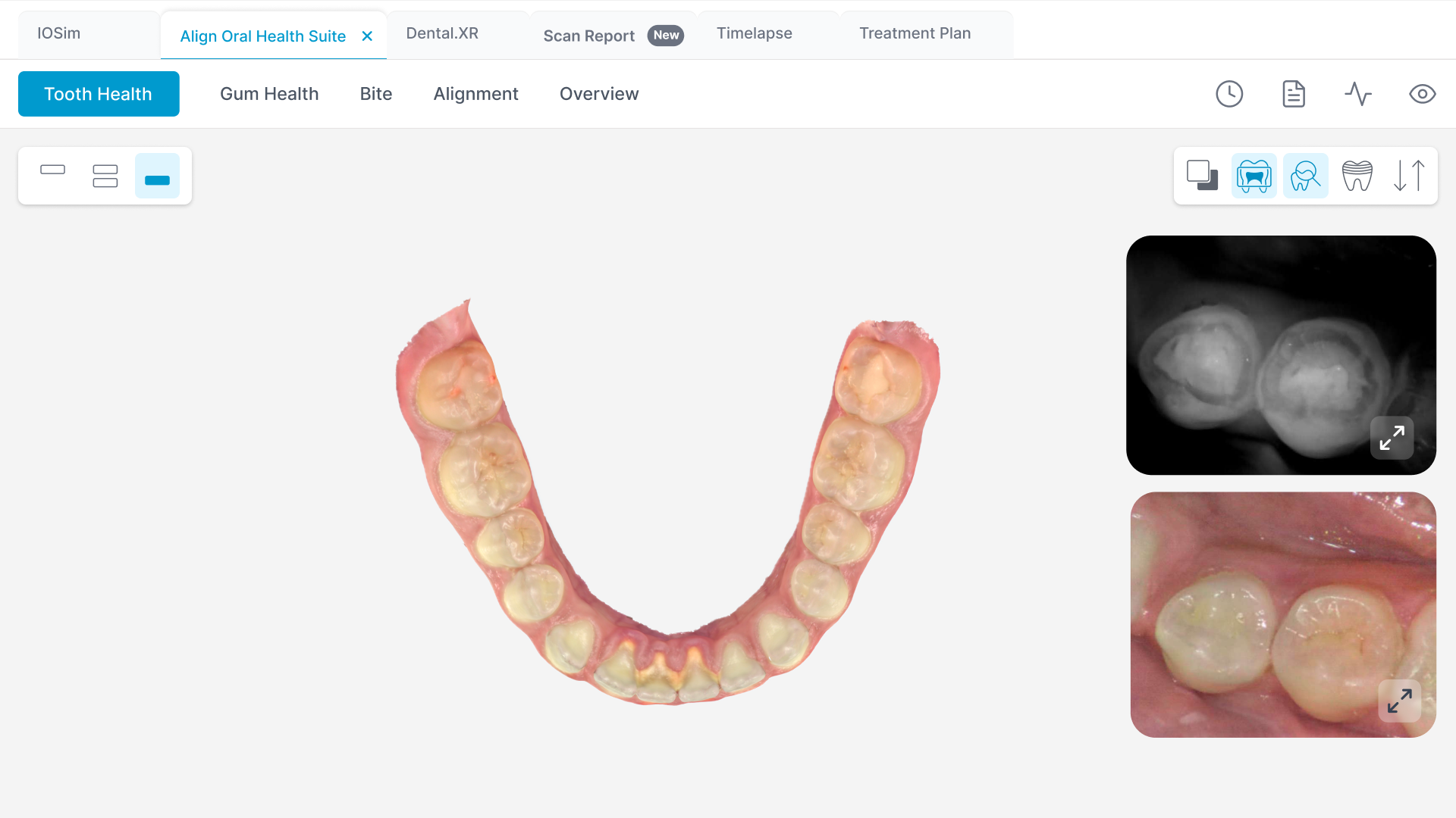
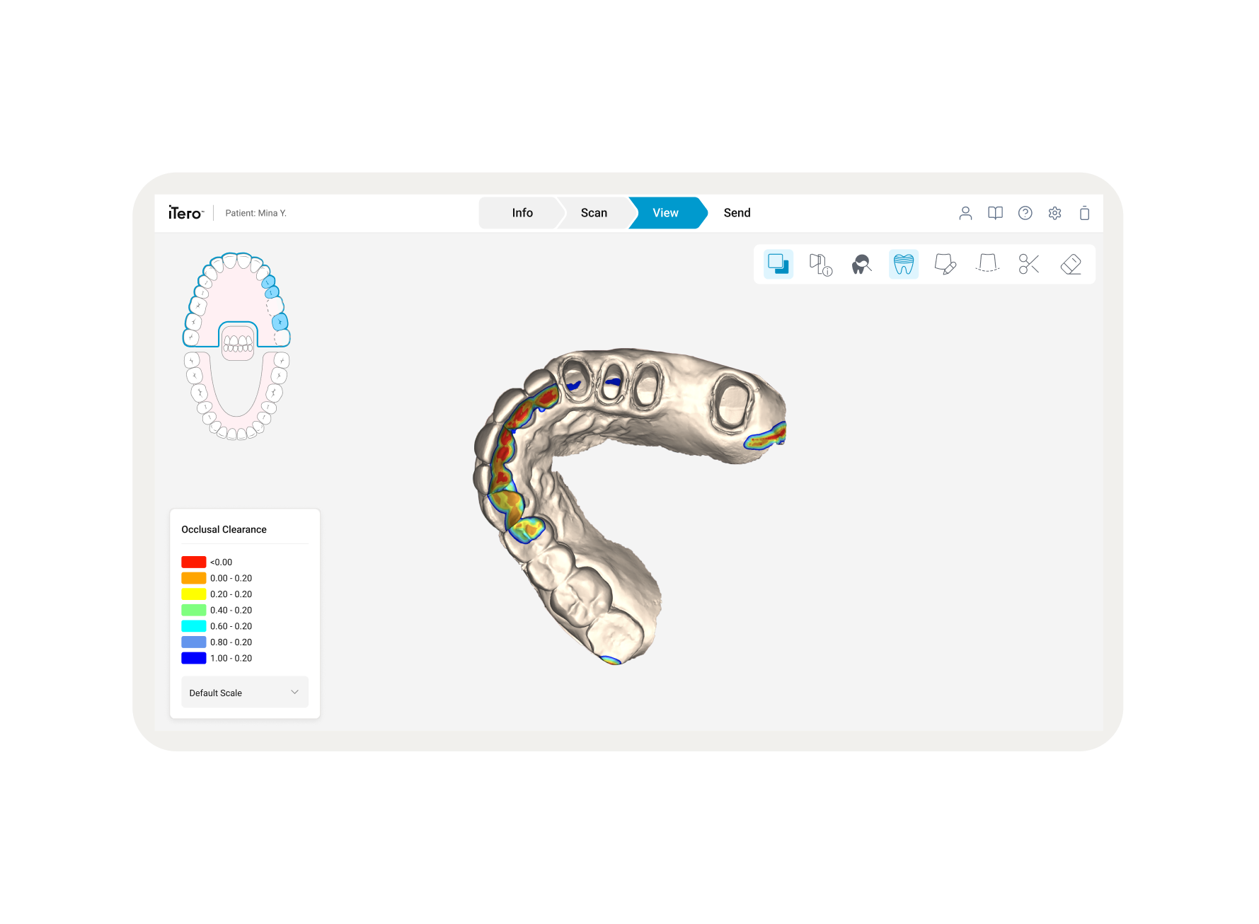
As part of a global UI Refresh for the iTero system, the Align Oral Health Suite (AOHS) required a navigation overhaul. This platform serves as the central hub on the iTero Cart, allowing clinicians to switch between 3D scans, diagnostic tools, and patient records. The objective was to modernize the interface and fix navigation failures that wasted valuable "chairtime" during patient consultations.
Overview
The legacy system utilized a rigid, linear navigation model that was ill-suited for a multitasking clinical environment:
The "Exit Trap
There was no clear way to go back to specific places. Pressing "Back" acted as a "Process Exit," forcing doctors to restart their entire workflow from the Diagnostic view.
Loss of State
Every time a doctor navigated away, the system reset the 3D model’s rotation and zoom. This forced doctors to manually "re-find" dental issues while the patient was waiting.
Current State Analysis
The interface was visually fragmented, leading to high cognitive load and slow reaction times during live procedures.
Problem Statement
Research identified four critical clinical behaviors that the new navigation needed to support:
Rapid Switching
There was no clear way to go back to specific places. Pressing "Back" acted as a "Process Exit," forcing doctors to restart their entire workflow from the Diagnostic view.
Historical Comparison
Every time a doctor navigated away, the system reset the 3D model’s rotation and zoom. This forced doctors to manually "re-find" dental issues while the patient was waiting.
Explaining Conditions
The interface was visually fragmented, leading to high cognitive load and slow reaction times during live procedures.
Decision Revisit
The system must allow users to revisit previous treatment steps with a few clicks to keep patients informed.
Clinical Needs & User Stories
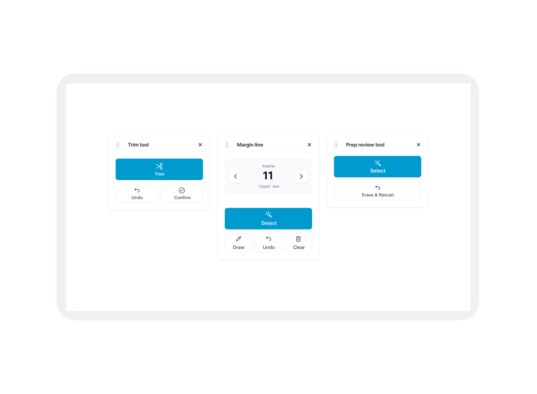
To solve the linear "Exit Trap," 3 distinct navigation models were prototyped and evaluated based on Touch Ergonomics, Screen Real Estate, and Cognitive Load:
Breadcrumbs
A traditional hierarchical model. While theoretically clear, this model required the text to be massive to meet medical touch-target standards for gloved hands, which would consume excessive vertical space.
Side Navigation
A structured, persistent overview. The main tradeoff was the reduction of horizontal real estate, which is critical for 3D patient scans.
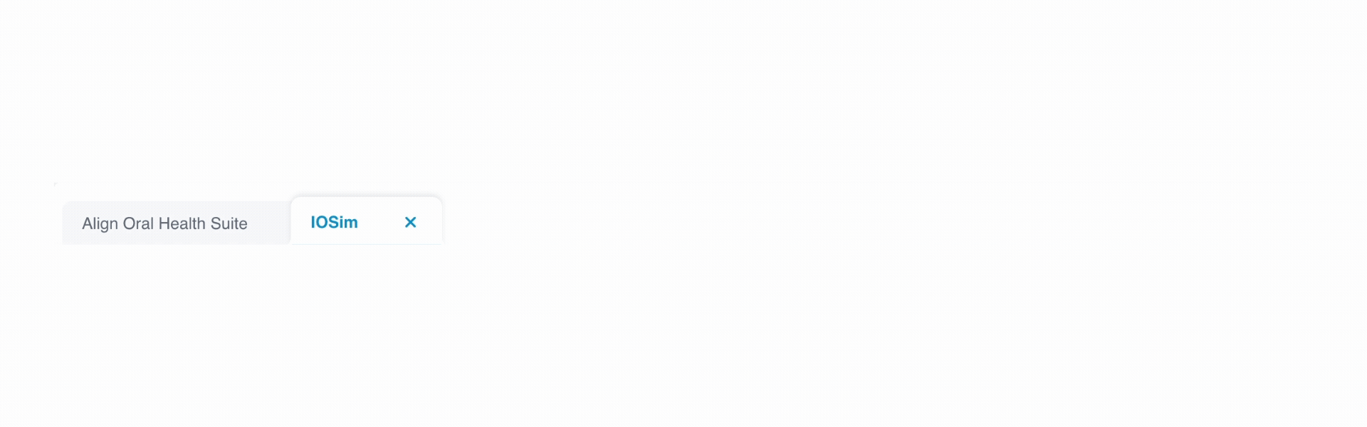
Browser-Style Tabs
A familiar multitasking mental model. This offered the potential for large touch targets and the ability to keep multiple tools open simultaneously.
Navigation Evaluation
The Three candidates — were put through rigorous feedback sessions and usability testing with clinicians.
The Winner (Tabs)
Clinicians found this model the fastest and most familiar. It allowed them to switch contexts without losing their place, proving superior for live consultations.
Sidebar (Secondary Option)
While helpful for structure, doctors felt it squeezed the 3D model. It remains a consideration for future data-heavy apps rather than primary scan navigation.
Breadcrumbs (Rejected)
Testing confirmed that breadcrumbs were too complex to process quickly while talking to a patient. The large touch-targets required for usability made them visually intrusive.
User Testing & Validation
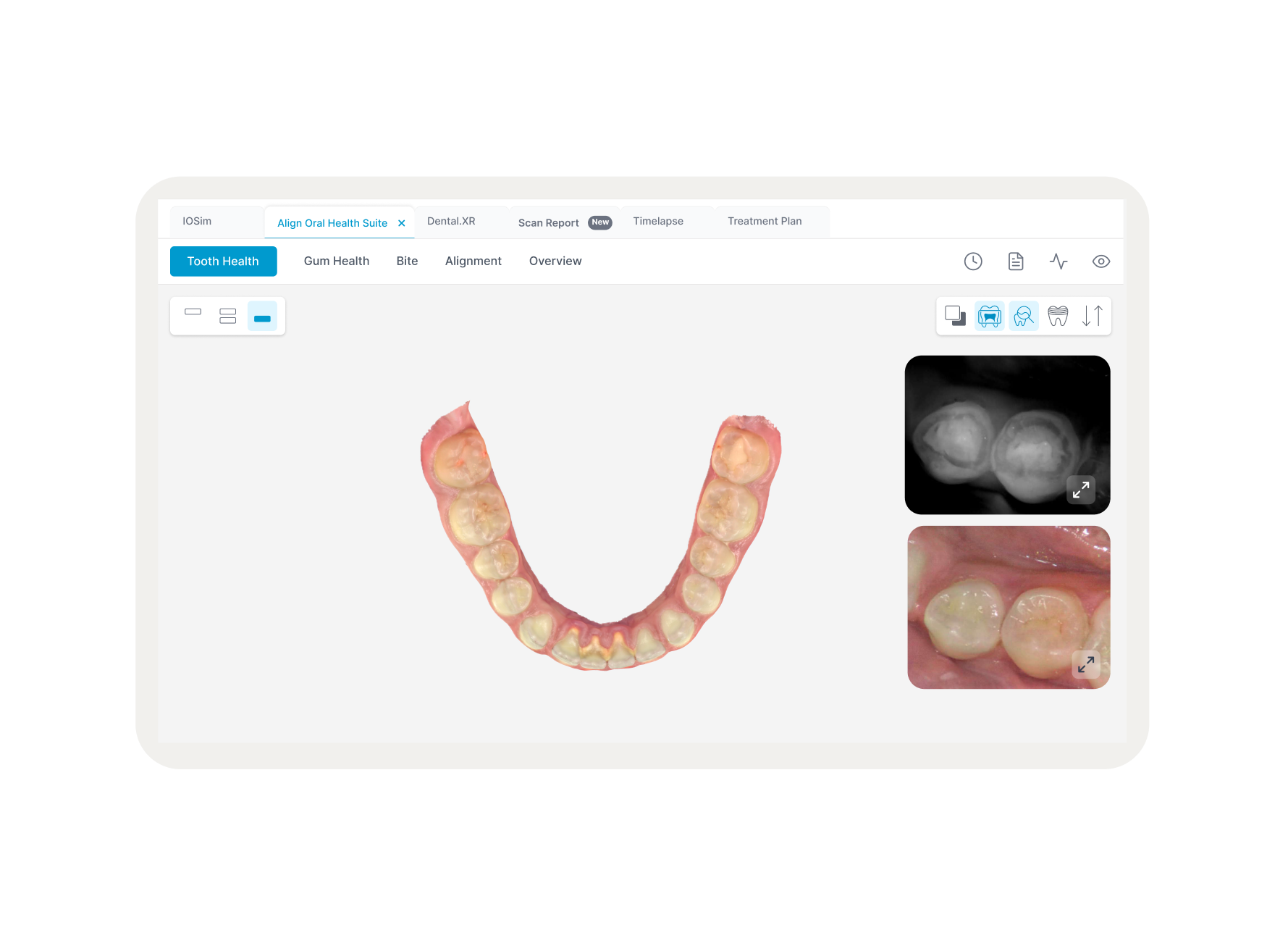
Design Soultion
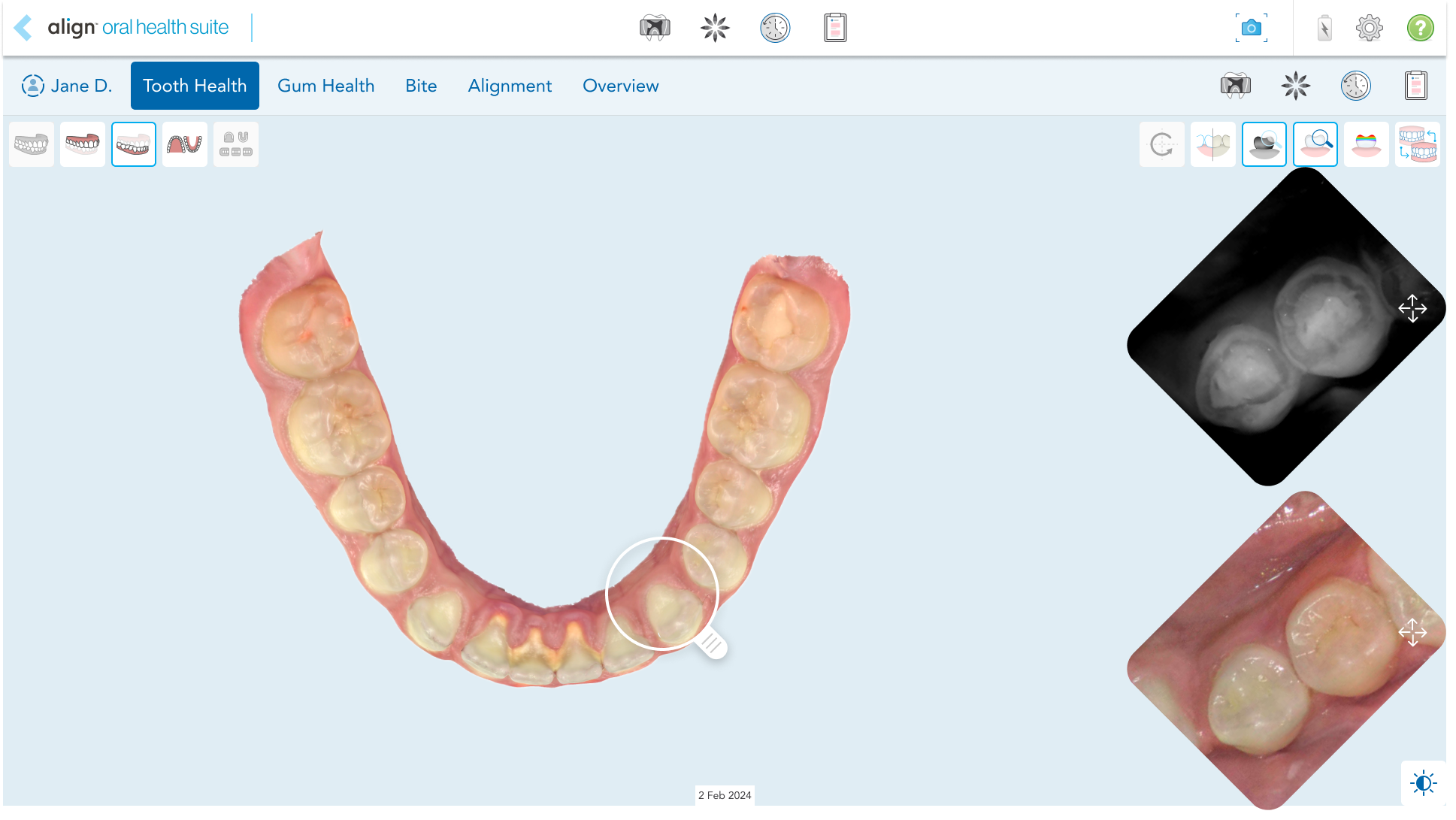
The final solution was a Tab Bar, inspired by the multi-tasking mental model of Web-Browser which unified the fragmented ecosystem into a single workspace. By replacing the destructive "Back" button with Persistent Tabs at the top of the screen, I transformed navigation into a visible, permanent destination with touch-optimized hit areas that prevent accidental exits.
Outcomes & Learnings
100% Navigation Success:
Zero accidental exits during validation testing.
42% Speed Increase
Switching between tools dropped from 18s to 10.5s, significantly reducing wasted chairtime.
Technical Efficiency
The "Wrapper" approach allowed us to unify the suite without a multi-year backend refactor of legacy applications.
User Confidence
Doctors reported feeling more "in control" of the software, allowing them to focus entirely on the patient.