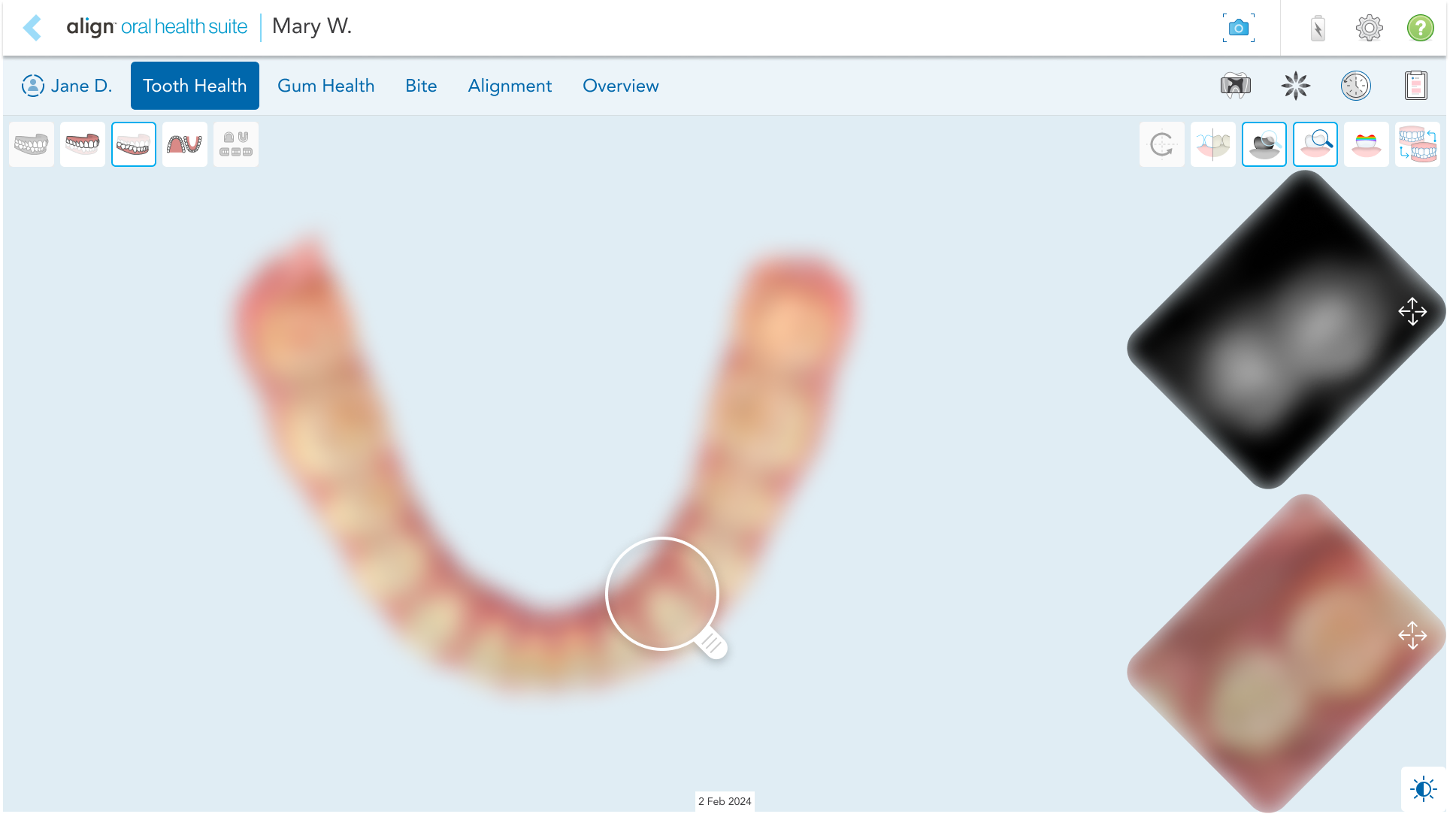
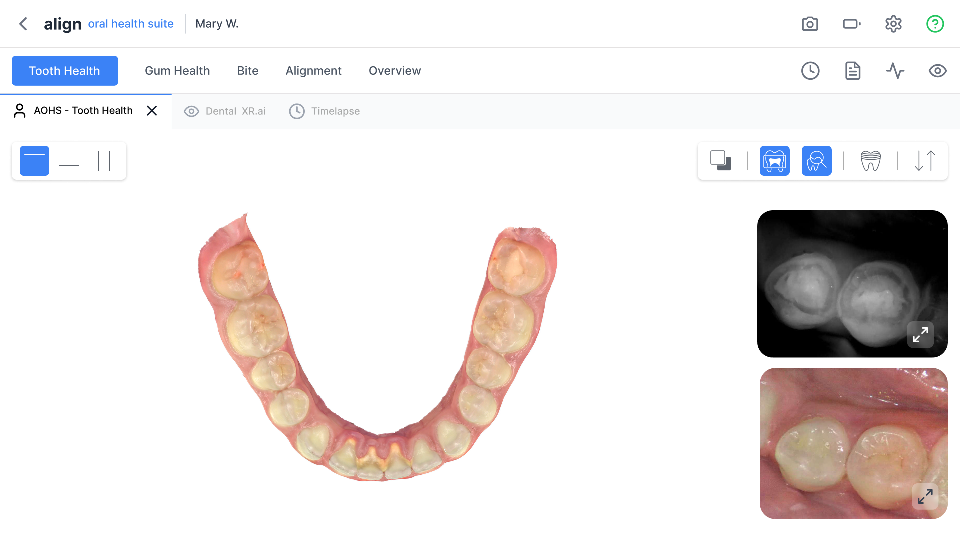
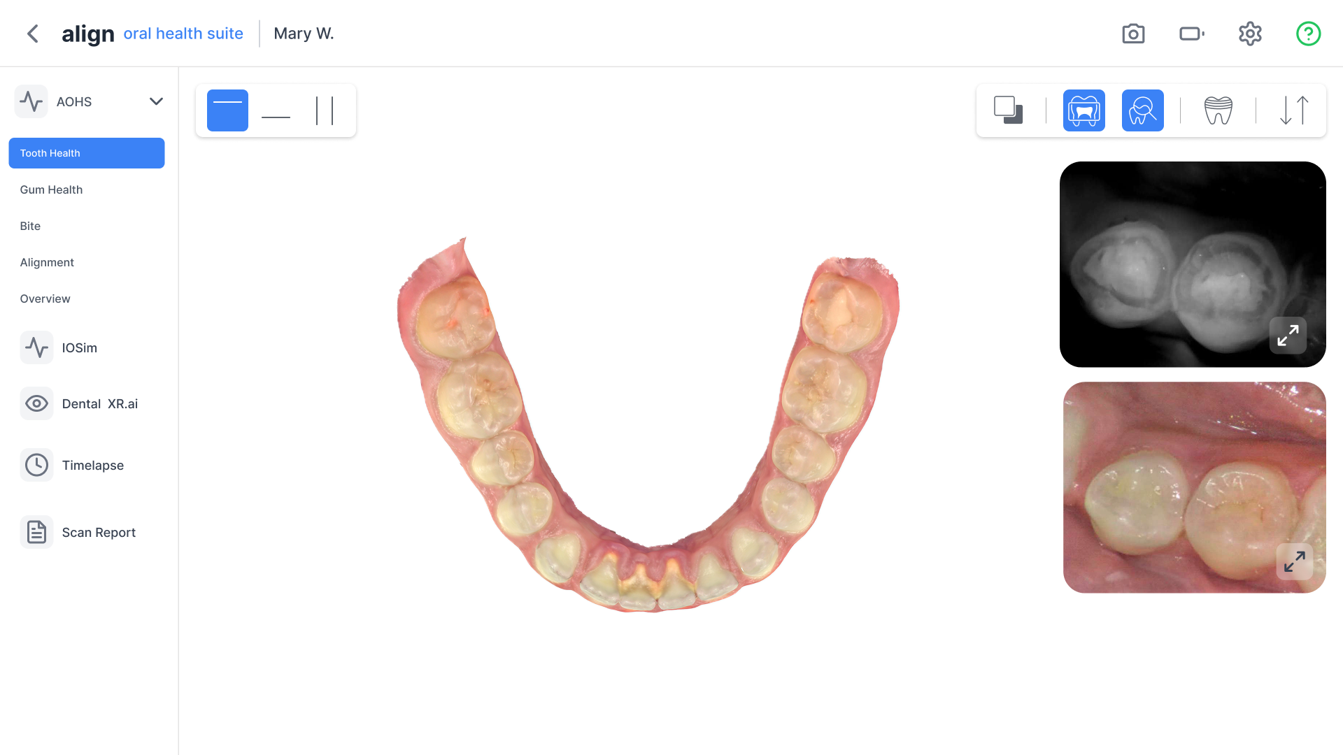
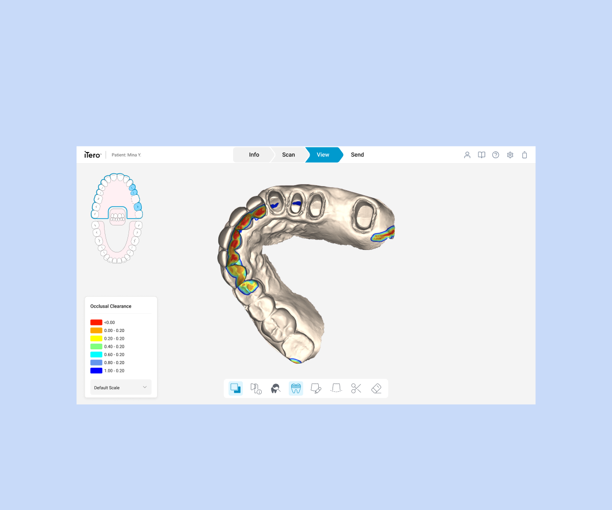
iTero™ Intraoral Scanners are digital systems used in dentistry and orthodontics. They capture accurate 3D images of patients’ teeth and gums, powering applications like:Orthodontics – Invisalign® treatment planningRestorative Dentistry – crowns, bridges, implantsNIRI – caries detectionTimeLapse – progress comparison over timeDoctors frequently need to switch between applications while explaining treatment to patients — which makes navigation critical.
Project Goals
Switch applications
Enable seamless transitions between apps during patient visits.
Compare scans
View current and past scans side-by-side easily.
Maintain flow
Present treatment journeys without breaking conversation.
I want to switch between different product applications quickly
So I can invest more time and thought into learning about the product itself and its potential.
Explaining Patient Conditions
When I'm with a patient
I want to easily explain the condition or situation with a dental X-ray
So I can help the patient understand the situation more clearly and build trust.
Showing Treatment Progress
When I'm with a patient
I want to show how the treatment affects the teeth bite over time
So I can strengthen the connection and trust between me and the patient.
Revisiting Previous Decisions
When I'm with a patient
I want to revisit previous decisions or steps with just a few clicks
So I can explain where we are in the treatment journey and help the patient feel informed and reassured.
Customer Goals
Access visuals fast
Quickly pull up the right visual or comparison to explain the patient's condition without breaking flow.
Toggle modules easily
Move between modules (Ortho, NIRI, TimeLapse) without extra steps.
Show progress clearly
Switch between past and current scans to highlight changes and build trust.
Use timelapse instantly
Access timelapse during sessions to re-align with patients and clarify next steps.
Exploration
We explored five different navigation models, each with unique tradeoffs.
1
Breadcrumbs + Third-Party Apps Icon
Pros
Shows hierarchy → clear context of where the doctor is
Provides quick access to external/third-party apps
Familiar web pattern
Cons
Takes up a lot of horizontal space
Too much detail → can confuse doctors in fast consultations
Requires doctors to read while talking, breaking flow
Reduces screen space for patient visuals
2
Forward & Backward Arrows
Pros
Clean, minimal UI
Easy to retrace recent steps
Very low learning curve
Cons
Only supports linear navigation → limited flexibility
Long press/dropdown shortcuts (if added) may be hidden or confusing
On tablets, long press is unreliable
3
Breadcrumbs Only
Pros
Shows hierarchy → clear context of where the doctor is
Easy to retrace path step by step
Cons
Adds cognitive load when multitasking with patients
Doesn't scale well across applications
4
Tabs (Browser-Style)
Pros
Familiar model (like Chrome)
Keeps multiple modules open at once
Easy, fast switching between tabs
Cons
Risk of overload → too many tabs open
Doctors may lose track of context
System performance may be impacted
5
Side Navigation
Pros
Always visible, structured overview
Provides quick access to all modules
Familiar pattern in professional/medical software
Cons
Not all iTero apps are optimized for side panel layouts → inconsistency
Reduces available space for patient visuals
Findings
Breadcrumbs (Options 1 & 3)
Informative, but take up too much space
Forward/Backward (Option 2)
Too limited for complex workflows
Tabs (Option 4)
Strong candidate, familiar, but needs safeguards against overload
Sidebar (Option 5)
Good for structure, but inconsistent across apps
Best Candidates
Tabs and Sidebar emerged as the strongest options for further testing.
Key Insights
1
Mirror doctor behavior
Doctors need navigation models that mirror how they talk: non-linear, patient-focused, and visual.
2
Reduce congnetive load
Overly technical solutions (breadcrumbs, side panel + breadcrumbs) add cognitive load in the middle of conversations.
3
Familiar patterns work
Simple, familiar patterns reduce friction, but need to be tested for performance and discoverability.
4
Trust is fragile
Patient trust is strongly tied to doctors not "getting lost" in the interface.
New UI Mockups
1. Tabs (Chrome-style)
Enable seamless transitions between apps during patient visits.
2. Sidebar
View current and past scans side-by-side easily.
3. Breadcrumbs
Present treatment journeys without breaking conversation.
Why we did this
Doctors should focus on the navigation itself, not get distracted by outdated screens.
These mockups are built for the long run — they are closer to the future UI of the system.
Testing with a modern look helps us get a clearer understanding of how each navigation style works in real use.
V0ICE OF COSTUMER
We ran feedback sessions with doctors to understand their experience.
What we tested:
First impressions of Tabs, Sidebar, and Breadcrum
How easy it was to move between modules
How confident doctors felt while talking to patients.
Tabs (Tabbed Navigation) - Winner
Doctors found it fast, familiar, and easy to learn
Works well in live consultations where speed and clarity are critical
2
Sidebar Navigation - Secondary Option
Helpful for structured workflows and when doctors want a full overview
Could be developed later, once all apps are aligned to support it consistently
3
Breadcrumbs - Less Preferred
They add context but take up space and distract in patient-facing sessions
Best used as a supporting element (not the main navigation)
Conclusion
Recommended Direction
The chosen direction is to move forward with Tabs as the primary navigation
We will keep Sidebar in consideration for future structured workflows, once all apps are aligned to support it consistently.
This approach balances familiarity, speed, and flexibility while maintaining focus on the patient-doctor interaction.
Impact & Results
42%
Navigation Time
Average time to switch between apps decreased from 18s to 10.5s
68%
Task Success Rate
Doctors successfully navigated to target apps without getting lost
Key Takeaway
The new tabbed navigation system significantly improved workflow efficiency while maintaining the doctor-patient interaction quality. Doctors reported feeling more confident and in control during consultations, leading to better patient outcomes and satisfaction.