Case
UX/UI
Health Tech
Workflow Redesign

Digitizing Home
Physical Therapy

What is Wizecare?
Practical solution that updates physical therapy for the home environment. This technology enables healthcare providers to conduct personalized therapy sessions directly with patients at home, making treatment more accessible and straightforward.
Context
Know Your Customer (KYC)
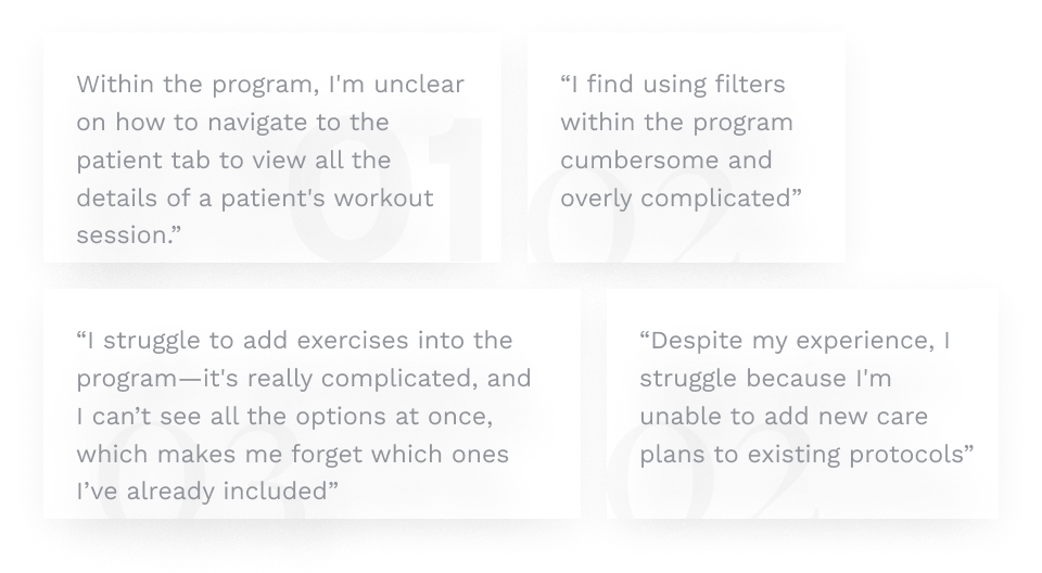
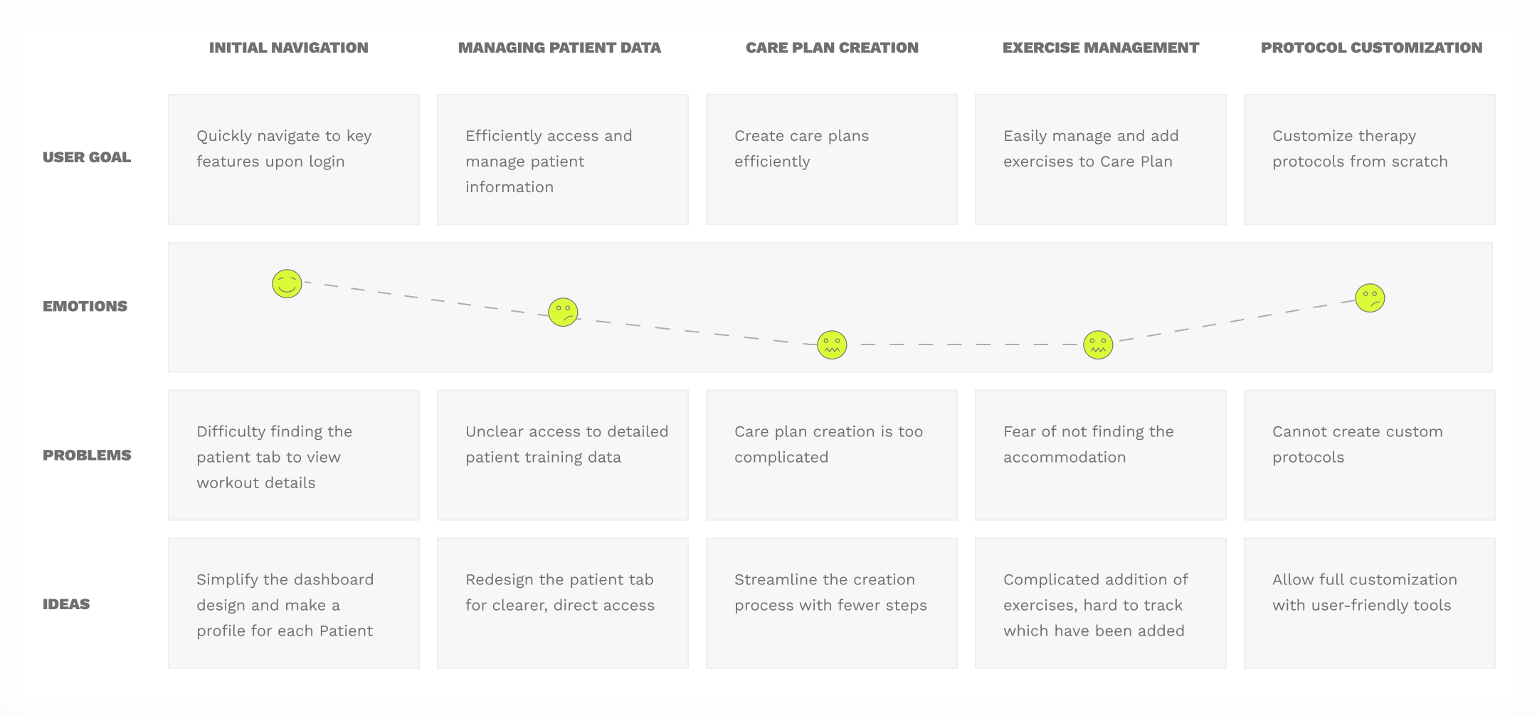
Understanding our primary users and their unique challenges.
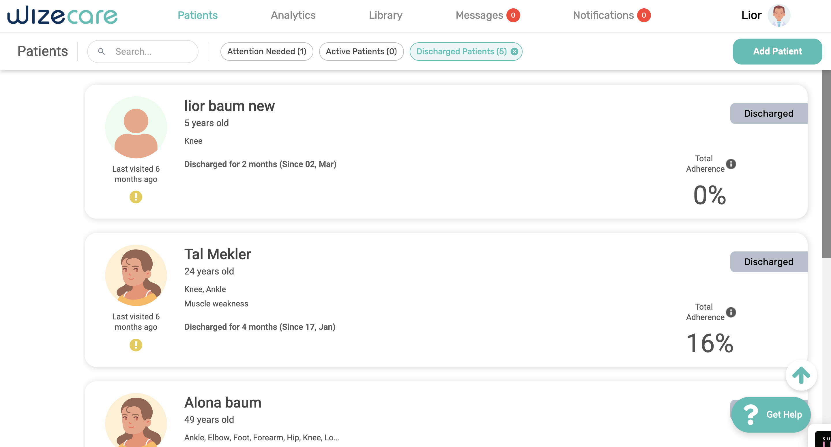
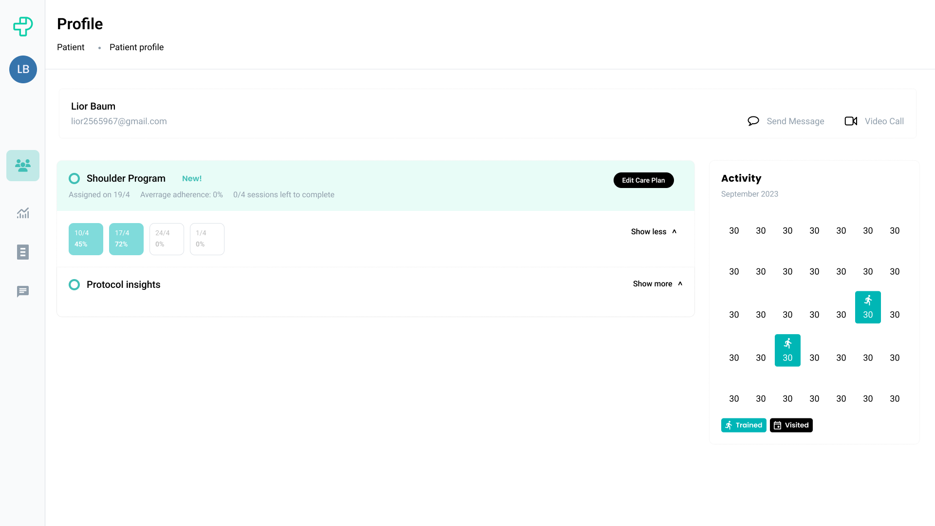
Target Users
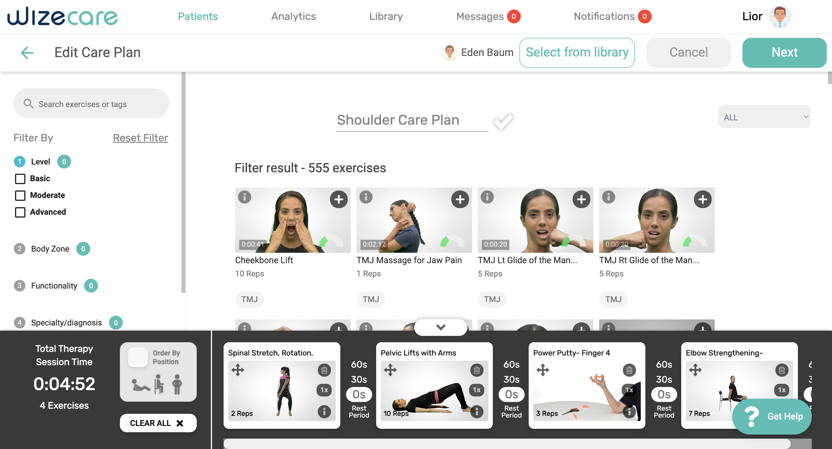
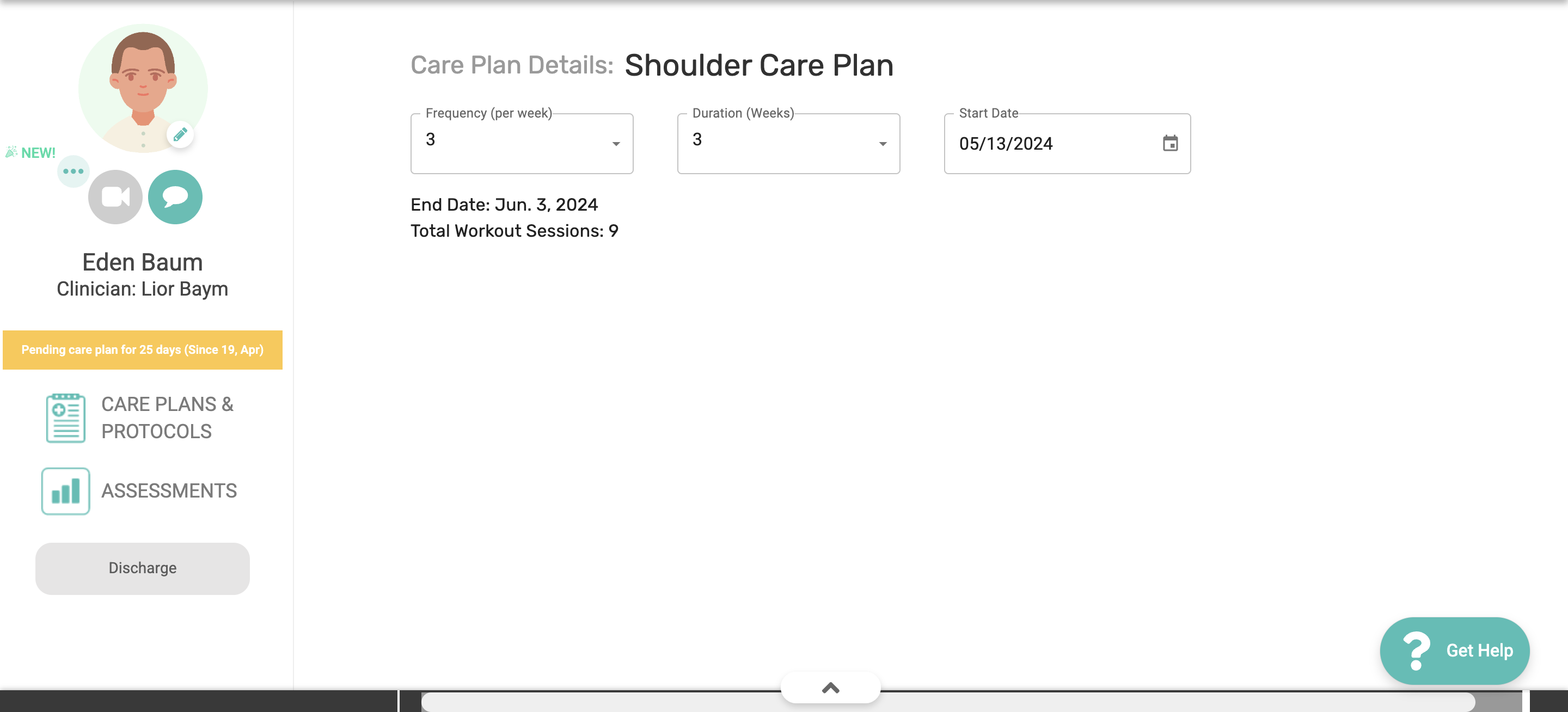
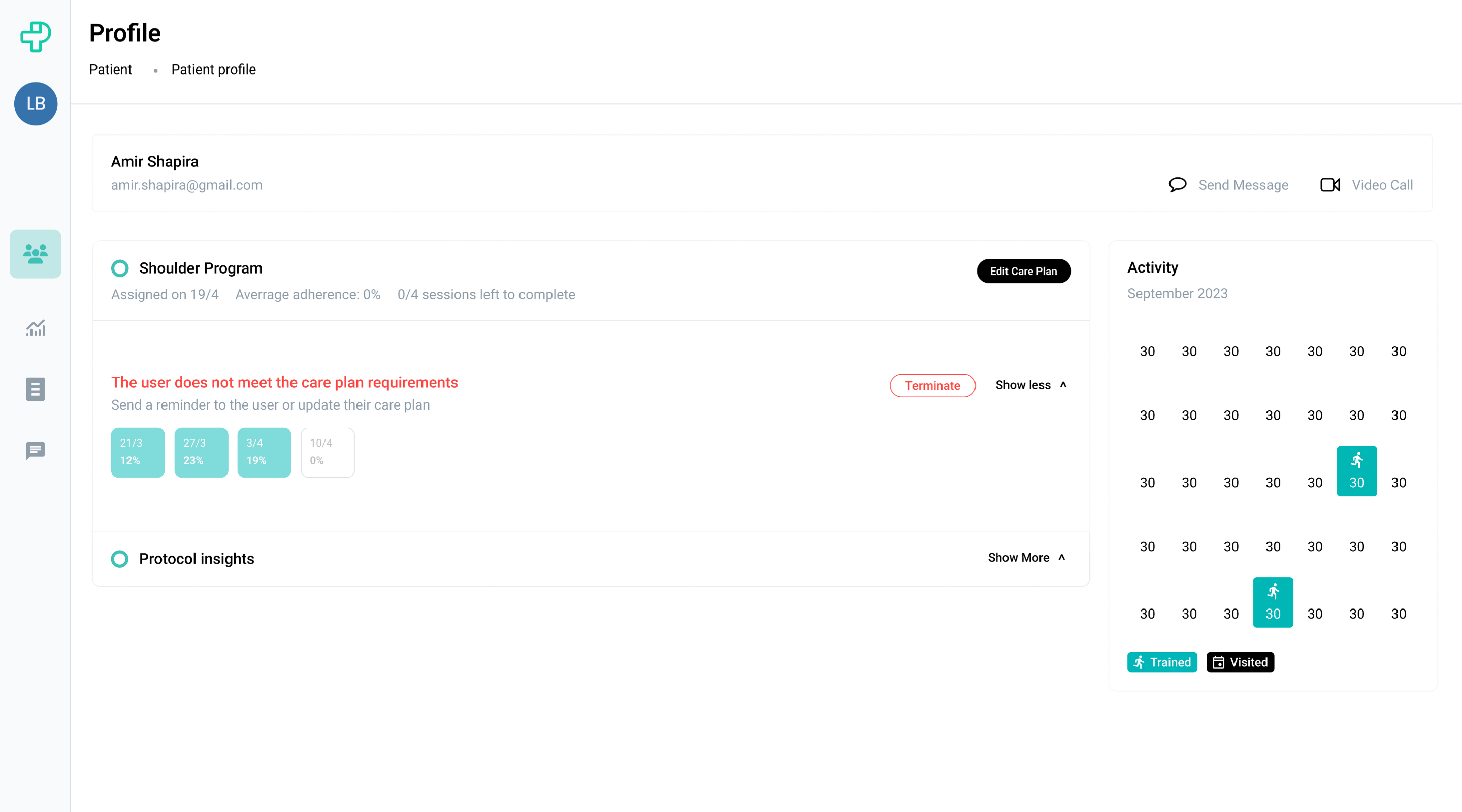
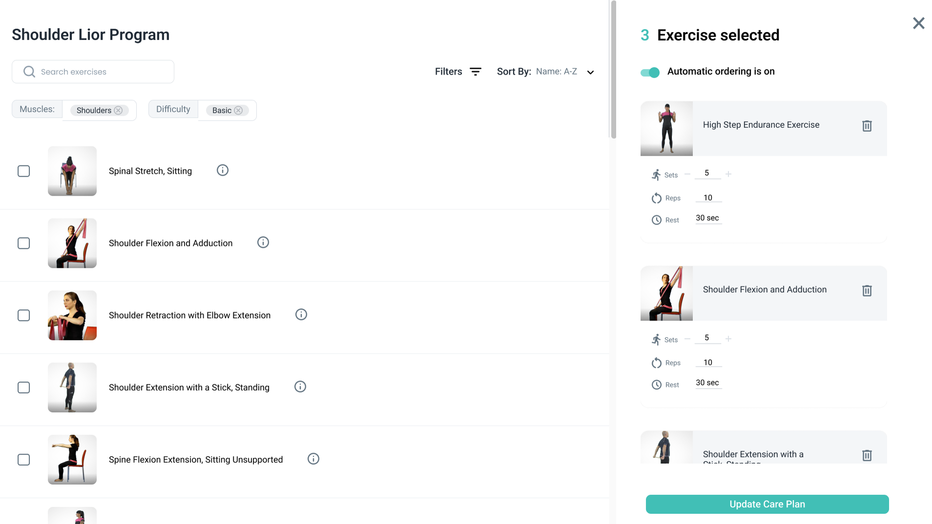
Physiotherapists who are looking to expand their service delivery beyond traditional in-clinic sessions, especially those interested in leveraging technology to manage and treat patients remotely.
The Problem
Core Challenges
1. Clinicians are tech-paranoid
Physical therapists are used to daily manual routines. Moving to adopt digital solutions is like market education.
2. Clinicians are extremely busy
Physical therapists have very busy workdays, which leaves them with limited time to fully engage with new products.
Problem and Research
Where the Friction Points Are
Through user research and support tickets, we identified three critical friction points in the platform.
1. Patient Screen Accessibility
Physiotherapists struggle with navigating the patient screen, finding it unclear which buttons to press to view the care plan and detailed patient information.
2. Care Plan Creation Process
The process of creating a care plan is overly complicated and time-consuming, requiring multiple steps that can confuse users.
3. Protocol Customization
Physiotherapists are unable to create treatment protocols from scratch, limiting their ability to tailor treatments to specific patient needs.
Defining The KPIs
Where the Friction Points Are
Through user research and support tickets, we identified three critical friction points in the platform.
Goals
Intuitive Navigation:
Simplify access to key features, ensuring users can easily navigate to and from the patient tab
Clear Exercise Visibility:
Overhaul the exercise management interface to display all options clearly
Simplified Protocol Creation:
Streamline the process for adding new care plans
Reduced Learning Curve:
Design the interface to be more straightforward for all users
KPIs
User Adoption Rate
Measure how quickly new users adopt the platform
Training Time Reduction
Reduce time needed for user onboarding
Decrease in Support Requests
Lower the volume of user support tickets
Research
User Interviews & Support Tickets
I visited several physiotherapy clinics to gain a clearer understanding of the challenges they face when using the platform.
empathy map
Understanding User Experience
In our ongoing efforts to enhance the usability and effectiveness of the WizeCare platform, we recognized the need to deeply understand the experiences of our primary users—physiotherapists.
Identify Pain Points
Pinpoint specific stages where physiotherapists face difficulties or frustrations with our platform
Enhance User Engagement
Understand and improve areas where users struggle with complexity or underutilize features
Streamline Processes
Discover and simplify redundant or overly complex steps in creating care plans
Jobs To Be Done
User Scenarios
Switching Between Product Applications
When I'm...
A new doctor
I want to...
Switch between different product applications quickly
So I can...
Invest more time and thought into learning about the product itself
Managing Patient Care Plans
When I'm...
With a patient
I want to...
Easily access and edit their care plan
So I can...
Provide personalized treatment without delays
Creating Custom Protocols
When I...
Need to create a new treatment protocol
I want to...
Build it from scratch with flexibility
So I can...
Tailor treatments to specific patient needs
Tracking Patient Progress
When I'm...
Reviewing patient adherence
I want to...
See clear metrics and progress data
So I can...
Adjust treatment plans effectively
Flow 1: Edit Care Plan
The Challenge
Our primary challenge was to streamline the user interface for a clearer, smoother user experience, while maintaining essential process steps. We focused on enhancing UX design principles to minimize cognitive load and optimize navigation.
Old patient page with cluttered interface
Old DeSIGN
Patient's Page
The old patient page design was cluttered, with oversized tabs dominating the screen and crucial adherence metrics lacking prominence.
Old patient page with cluttered interface
NEW DESIGN
Patient's Page
In the new design, I focused on clarity and usability, ensuring physiotherapists can easily view all patient details and adherence levels.
Old patient page with cluttered interface
Old design
Patient Profile
In the new design, I focused on clarity and usability, ensuring In the old design, the absence of a dedicated patient page caused confusion among physiotherapists, who were unclear on how to view patient plans.
can easily view all patient details and adherence levels.
Old patient page with cluttered interface
New design
Patient Profile
In the new design, I created a dedicated patient page that includes detailed patient plan data, making it easier to view and edit these plans, a feature lacking in the old design.
Old patient page with cluttered interface
Old design
Edit Care Plan
The old process was lengthy and cluttered, spread across multiple screens without clear separation between exercises. This layout led to confusion for physiotherapists, especially when managing numerous exercises.
Old patient page with cluttered interface
New Design
Edit Care Plan
In the new design, I refined the interface by consolidating all features onto one screen and removing irrelevant information. This simplifies the workflow for physiotherapists. Each exercise is also displayed on its own card, improving organization and ease of comparison within the program.
Old patient page with cluttered interface
2nd flow: Building a Protocol
The Challenge
In the old design, the absence of a defined protocol creation workflow posed significant challenges. The redesign addressed this by mirroring the existing care plan creation flow, enhancing consistency and simplicity. By integrating similar navigational elements into the user interface, I simplified the new protocol workflow, ensuring a familiar and intuitive user experience that improved usability and facilitated seamless adoption
Old patient page with cluttered interface
Old Design
Building a Protocol from scratch
The old design was complex and inefficient for busy physiotherapists, with cumbersome multi-step navigation. However, we retained its effective terminology and key functionalities. By analyzing the previous workflow, we identified essential features to enhance usability in the new design, ensuring a smoother transition for users familiar with the old system.
Old patient page with cluttered interface
nEW DESIGN
Building a Protocol from scratch
The redesigned physiotherapy protocol feature focuses on minimizing screen usage and integrating a drag-and-drop interface. This streamlined approach allows for rapid, intuitive customization of treatment plans, enhancing efficiency for busy healthcare professionals.
Old patient page with cluttered interface
Impact
45%
User Adoption
Increase in platform adoption rate
60%
Training Time
Reduction in onboarding time
70%
Support Requests
Decrease in support tickets
Design Learnings
Consistency is key
Mirroring existing workflows when introducing new features helped users adapt faster
Reduce cognitive load
Consolidating information onto single screens simplified complex workflows
Card-based design works
Breaking down exercises into cards improved organization and comparison
On-site research is invaluable
Visiting clinics revealed pain points that support tickets couldn't capture