The Scan page is the central workspace for clinicians. It supports multiple tools — scanning, trimming, viewing, and analysis. Over time, new features were added independently, creating visual inconsistency and scattered action points.
The Goal
Redesign the Scan page to unify all scan actions in a single toolbar and improve visual consistency across modes.
Context
Purpose
The primary workspace where clinicians capture real-time digital scans. Tools scattered across multiple UI regions made navigation difficult.
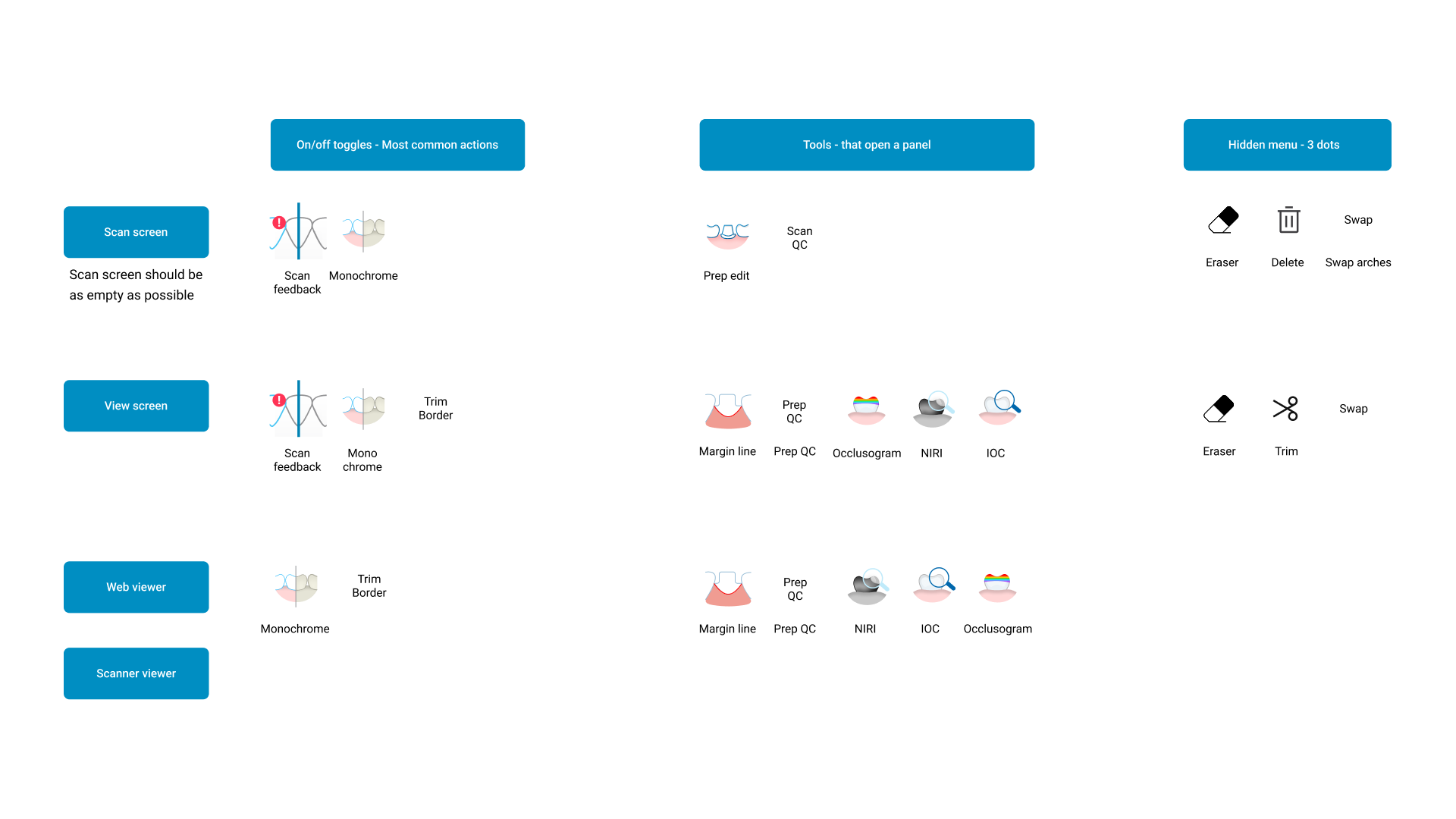
Scan Controls
Start, Pause, Rescan
View Modes
Upper/Lower, Color/Monochrome
Tools
Trim, Margin Line, Eraser, Occlusogram, NIRI/IOC
Settings
Settings & Calibration Panels
Current UI
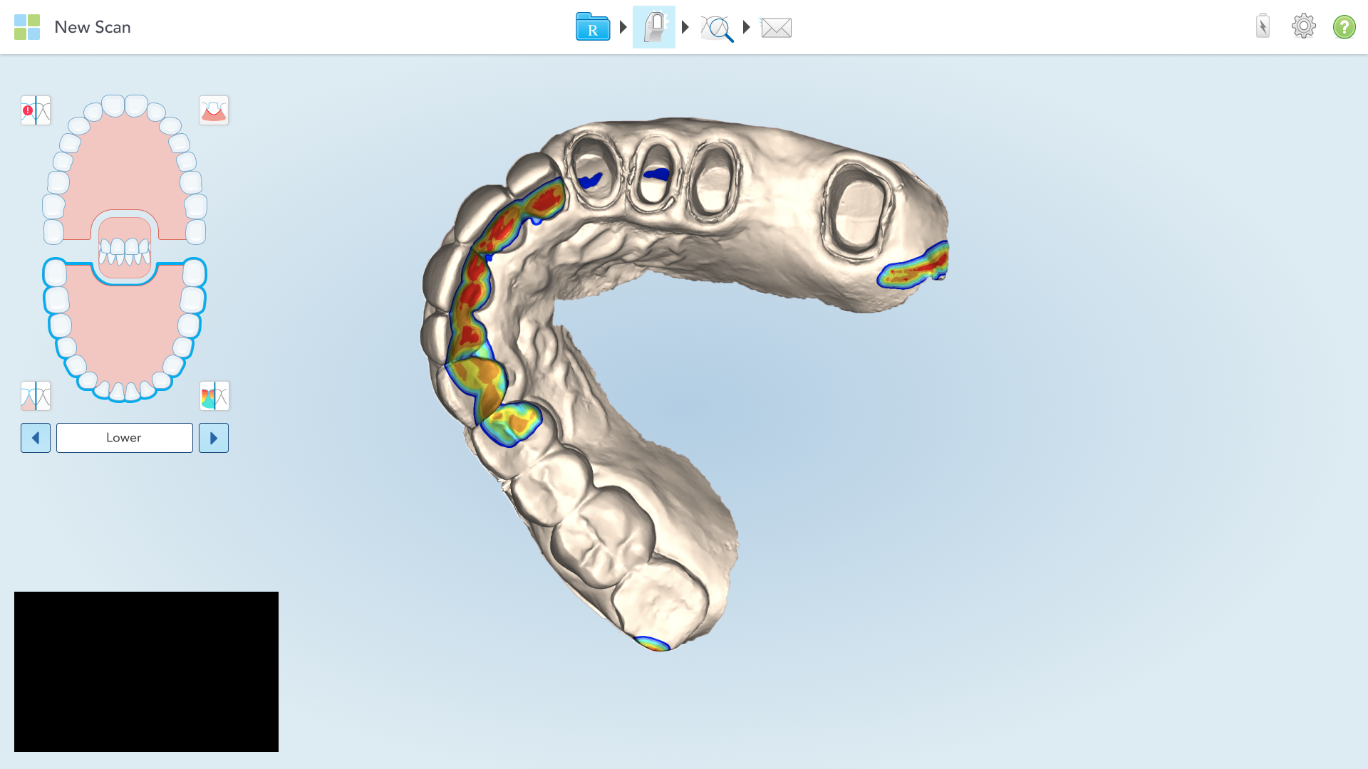
Scan Page
The primary workspace where clinicians capture real-time digital scans. Tools scattered across multiple UI regions made navigation difficult.
Current UI
View Page
Used to review and analyze completed scans. Similar layout inconsistencies with tools distributed across different areas.
Problem
Scattered Interface, Scattered Focus
Icons placed across multiple regions
Tools were scattered across the top bar, floating overlays, and contextual menus with no unified structure.
No logic connecting tool grouping
Related actions weren't grouped together, making workflows inefficient.
Mixed iconography styles
Inconsistent visual design and unclear hierarchy created confusion.
Time lost searching for tools
Clinicians spent more time hunting for tools than using them.
Research & Insights
Understanding the Workflow
Observation of scanning sessions
Observation of scanning sessions
Observation of scanning sessions
Findings
Making automation visible and explainable was critical for user adoption
Grouping related tools increases efficiency
Clear visual hierarchy reduces cognitive effort
Analysis
Key Mapping (Tool Audit)
We analyzed every tool across the scanning environment — Scan Screen, View Screen, Web Viewer, and Scanner Viewer — to understand visibility, dependencies, and frequency of use.
Design Process
1
Audit
Tools were scattered across the top bar, floating overlays, and contextual menus with no unified structure.
2
Validation
Tested grouping logic with clinical users.
3
Redesign
Created new toolbar aligned with the Align Design System.
4
Implementation
Collaborated with development for spacing, hover states, and responsiveness.
Visual Design
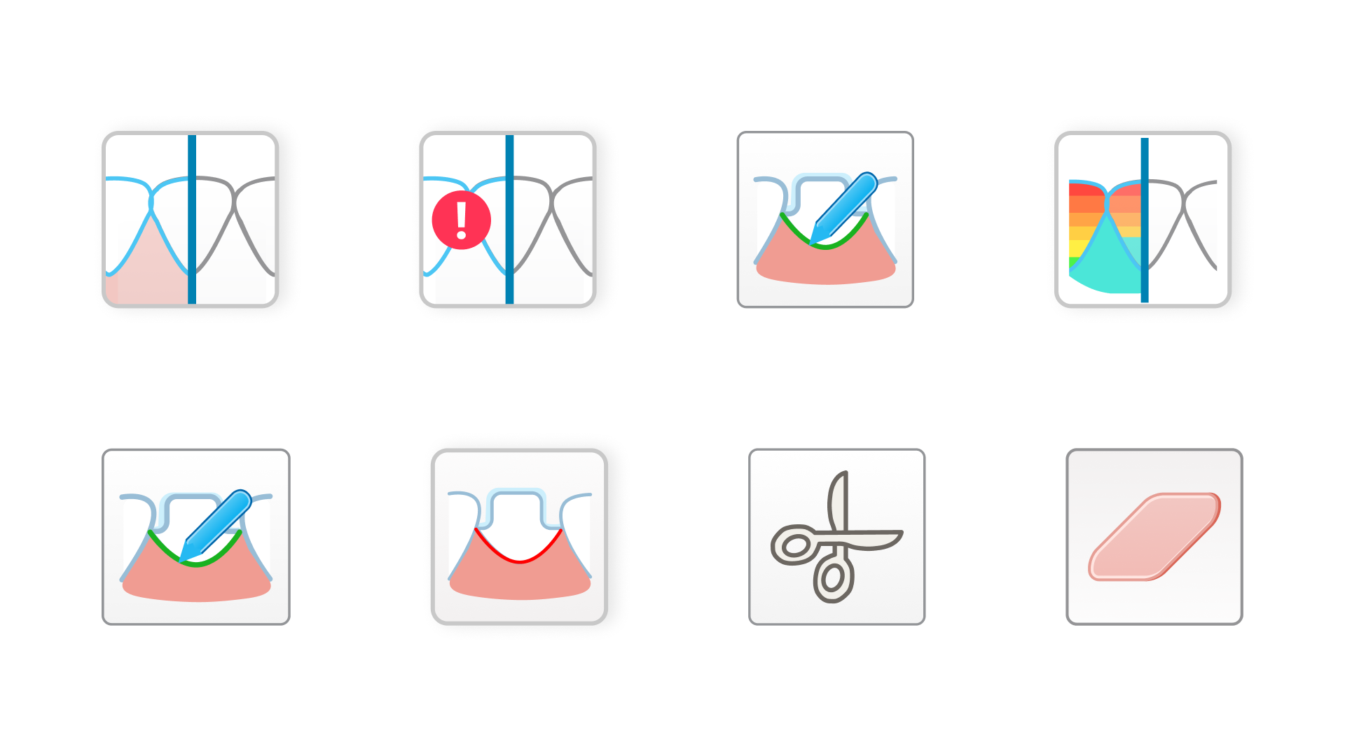
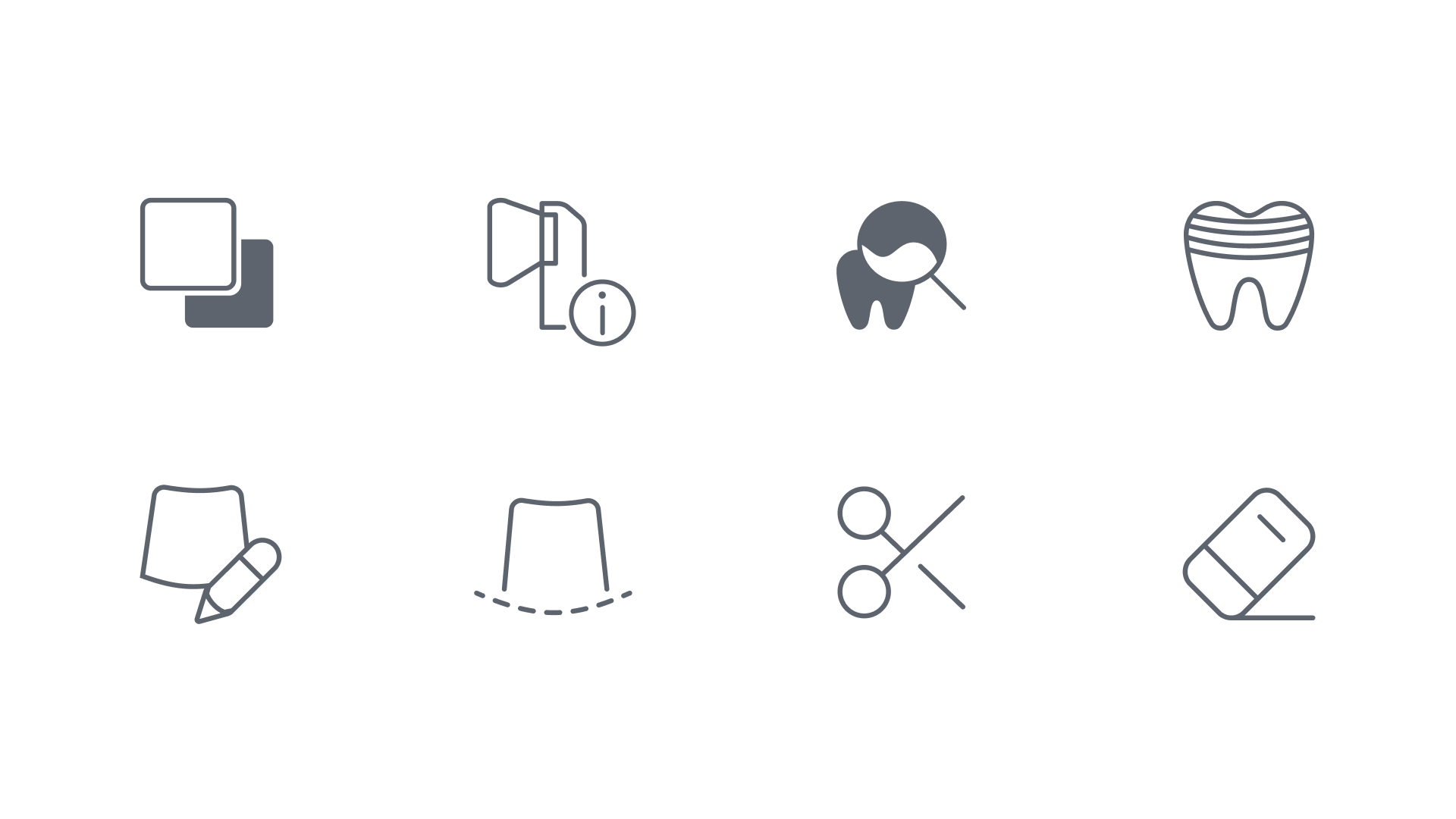
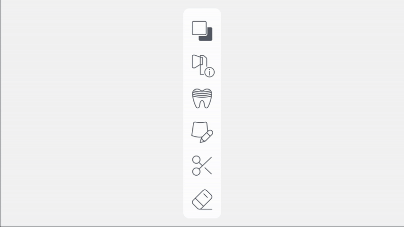
Icon System
Old Icons
Inconsistent stroke weight
2px - 3px varied
Mixed sizing
16px - 20px varied
No grid system
Inconsistent alignment
Poor contrast
Hard to see on backgrounds
New Icons
Uniform 1.5px stroke
Consistent across all icons
24px icon grid
Standard sizing system
Optical alignment
Grid-based positioning
Enhanced contrast
Works on all backgrounds
Consistent Grid
Redesigned all icons using consistent grid and stroke.
Interactive States
Added active color feedback.
High Contrast
Improved contrast for both bright and dark 3D scan backgrounds.
User Testing
Horizontal vs Vertical Toolbar
We conducted user testing with doctors to determine which toolbar orientation would be easier to use during patient procedures. The decision between horizontal and vertical placement was critical for workflow efficiency.
Vertical Toolbar
Tested along the right of the screen with tools stacked vertically.
Findings
Took more vertical screen space, reducing scan view area
Tools felt disconnected from natural workflow sequence
Harder to reach on touch-based interface during procedures
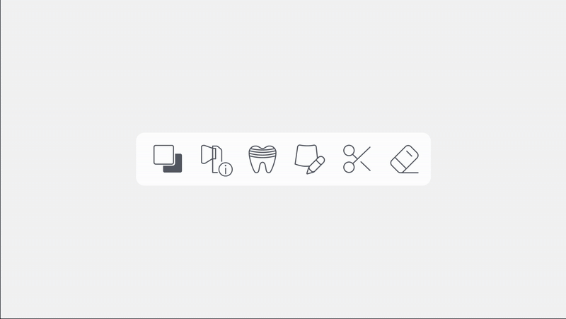
Horizontal Toolbar (Selected)
Bottom horizontal toolbar with tools spread from left to right.
Benefits:
Maximizes vertical space for scan view
Natural left-to-right workflow progression
Closer to doctor's natural hand position for touch-based interaction
Testing Results
28% Faster
Consistent across all Tool selection speed with horizontal layouticons
7/10 Doctors
Preferred horizontal placement over vertical
Better Visibility
More scan area visible during procedures
New design
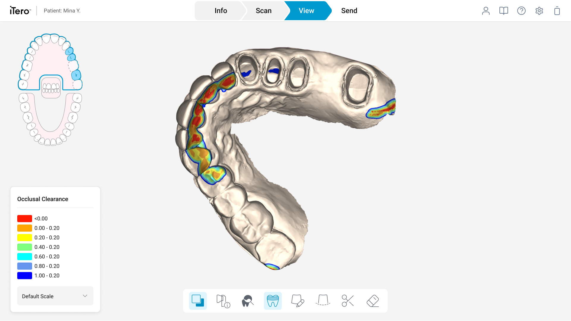
New Toolbar on Scan Page
Scan Page with New Toolbar
The unified horizontal toolbar now sits at the bottom of the Scan Page, consolidating all scanning actions in one predictable location. This addresses the original problem of scattered tools by giving doctors a single, consistent place to find everything they need during real-time scanning procedures.
What Changed from the Old Scan Page
No more floating menus
All tools moved from scattered overlays into one unified toolbar
Maximized scan view
Horizontal placement preserves vertical space for the 3D scan model
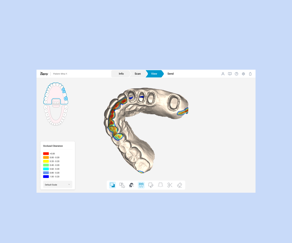
The same unified toolbar design is applied to the View Page, creating consistency across the entire scanning workflow. Doctors can now seamlessly transition from scanning to reviewing completed scans with a familiar, predictable tool layout.
What Changed from the Old View Page
Unified placement:
Analysis tools (NIRI, Occlusogram) no longer hidden in separate menus
Reduced clutter
Less frequently used actions moved to hidden menu, cleaning up the interface
Consistent with Scan Page
Less frequently used actions moved to hidden menu, cleaning up the interface
Impact & Results
25%
Tool Access Time
Faster tool access time during scanning sessions
40%
Misclick Rate
Fewer misclicks and navigation errors
92%
User Satisfaction
Positive feedback on interface clarity
Learnings
Unified grouping significantly reduces friction
Icon consistency improves recognition and comfort
Design consistency enhances trust and speed
Next Steps
Extend to Prep and QC workflows
Add customization and user shortcuts
Validate usability under different lighting conditions