The iTero Store is a key touchpoint for dental professionals purchasing accessories and scanner parts. Over time, inconsistent layouts and missing key user flows reduced trust and usability.
The redesign focused on creating a cohesive, interactive experience aligned with iTero's ecosystem and clinical precision.
Added side filters with consistent styling and responsive behavior.
Product Grid
Problem
Uneven spacing and inconsistent image ratios.
Solution
Created a modular grid with unified spacing and improved product labeling.
Typography & Branding
Problem
Mixed font styles and weak hierarchy.
Solution
Aligned fonts and spacing with iTero.com design system for a more clinical, professional look.
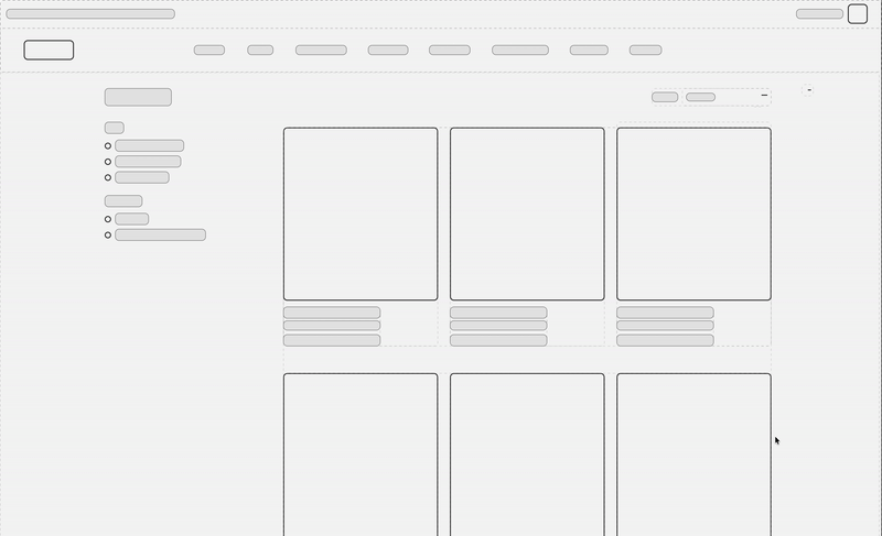
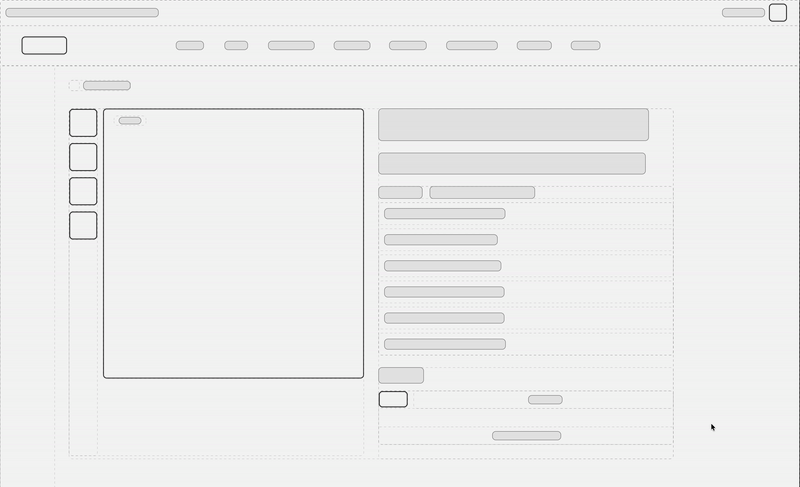
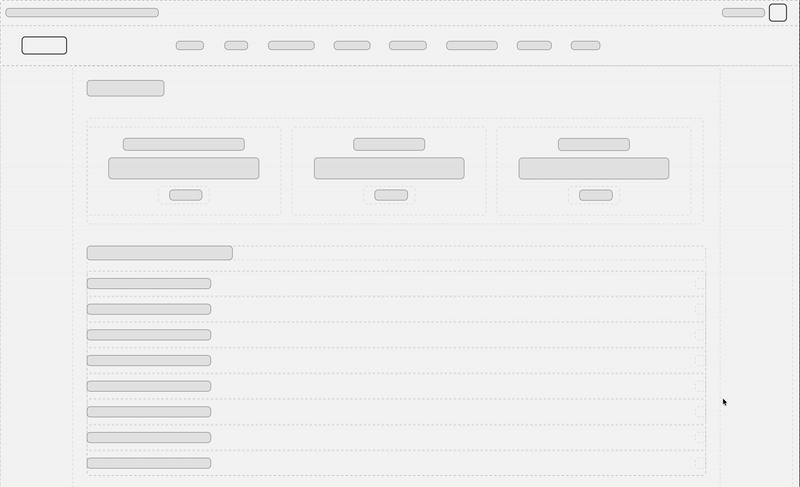
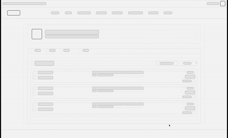
LO-FI Wireframes
Initial Concepts
Low-fidelity wireframes helped us iterate quickly on layout and information architecture before committing to visual design.
1
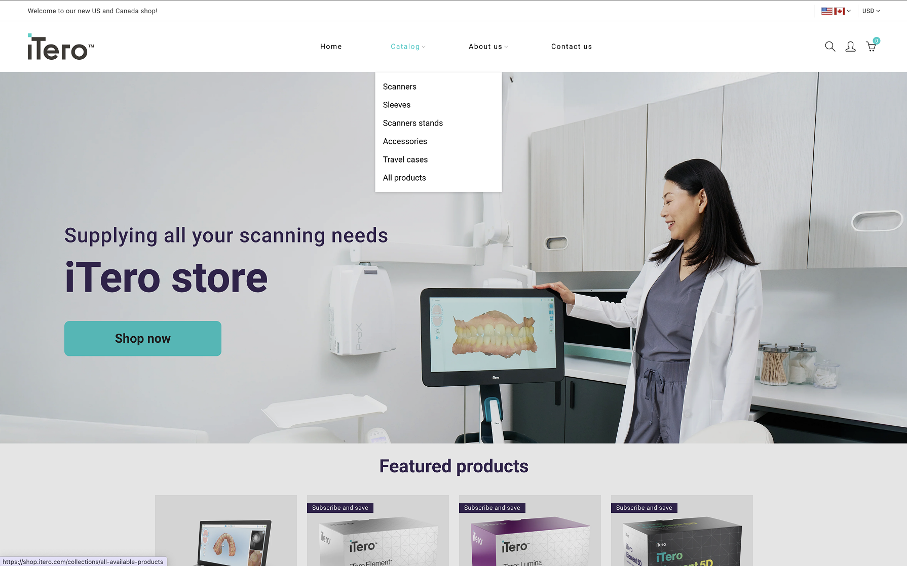
Home Page
Featured products, category navigation, and quick access to account and cart.
2
Products Page
Product grid with sidebar filters and sorting options for efficient browsing.
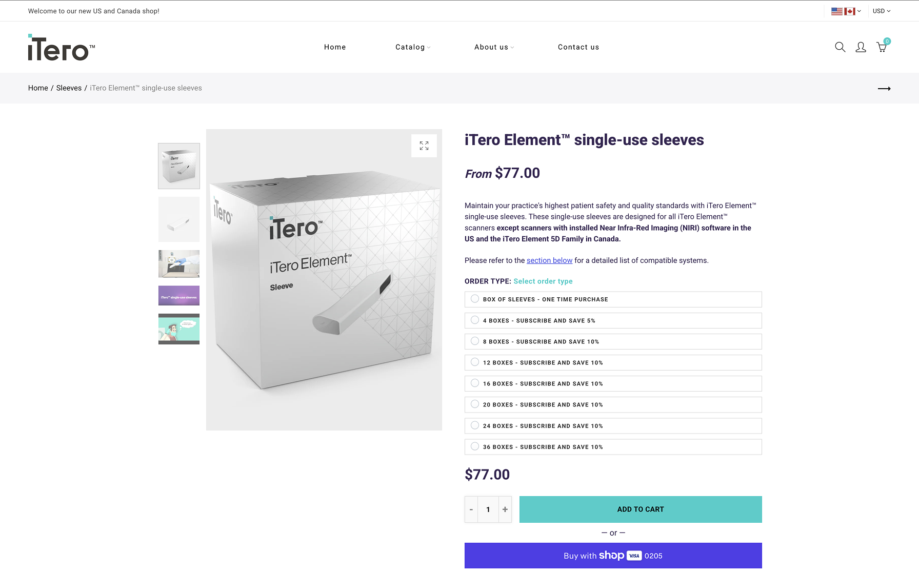
3
Product Page
Detailed product information, specifications, and clear add-to-cart action.
4
Help Center
Searchable FAQ with categorized support topics.
5
Subscribe & Save
Subscription dashboard with benefits and management tools.
6
Account Page
Profile settings, order history, and quick actions.
NEW Design
The New Experience
High-fidelity designs bringing the wireframes to life with the refined visual system and interactions.
1
Home Page
The home page received a complete overhaul with improved grid consistency, better spacing, and more informative product presentation. The redesign focused on helping users understand product offerings at a glance while maintaining visual clarity.
2
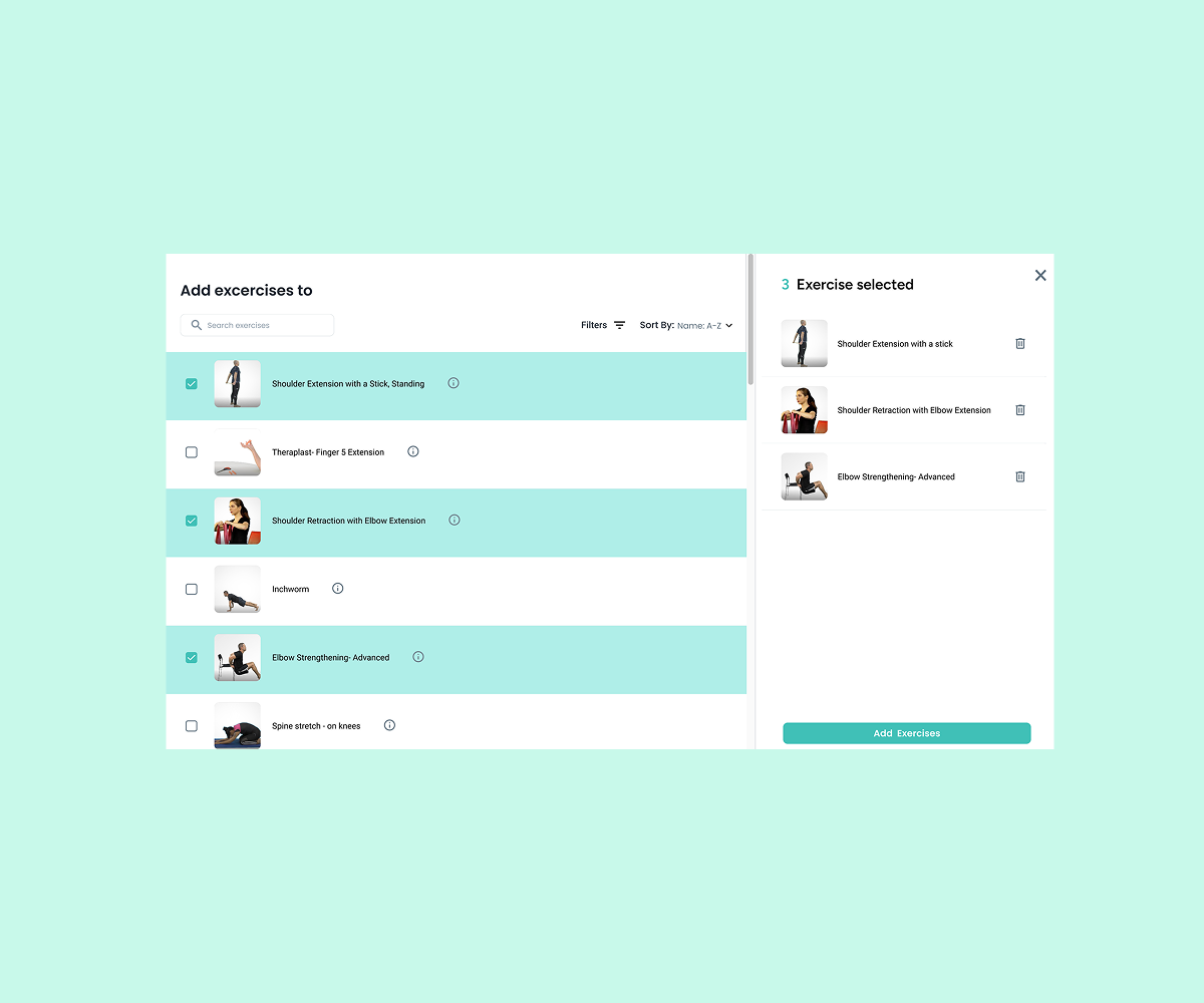
Products Page
The products page now features a sophisticated filter system, improved sort options, and a unified navigation approach. We consolidated multiple navigation bars into a single, intuitive system that doesn't overwhelm users.
3
Product Page
For the product detail page, we maintained the core structure and familiar layout options that users were accustomed to, but refined the UI with cleaner styling, better information hierarchy, and improved mobile responsiveness.
4
Account Page
The account page serves as the central hub for user management, bringing together profile settings, order history, subscriptions, and preferences in one unified dashboard. This consolidation reduces navigation complexity and puts user control front and center.
New pAGE
Subscription & Save
The new Subscription & Save feature allows users to receive updates or auto-reorders for consumables. Many clinics repurchase sleeves and accessories regularly — automating these saves time and ensures continuity in clinical workflow.
Doctor Testimonials
Real feedback from practitioners highlighting convenience and cost savings
Process Steps
4-step visual guide showing how to choose, schedule, receive, and manage subscriptions
Key Benefits
Highlighted savings (15% discount), convenience, and flexibility messaging
New pAGE
Help Center
The redesigned Help Center gives clear access to FAQs, troubleshooting, and support. Previously, users had to leave the store to find support pages — centralizing help improves continuity and reduces frustration.
Searchable FAQs
Find answers quickly with categorized topics (Orders, Products, Billing)
Quick Support Access
Direct access to chat or support forms
Visual Guides
Step-by-step visual guides for common tasks
Process
Tools & Workflow
The project used a combination of advanced collaborative tools for rapid iteration and interactive testing. This setup allowed the team to validate usability decisions before development, saving significant iteration time.
Figma
Designed the full UI system, components, and responsive layouts
Cursor
Built interactive prototype with real navigation logic
Netlify
Deployed prototype for remote user testing and feedback
Workflow Benefits
Rapid prototyping
Built fully functional prototypes in hours instead of days
Real user testing
Deployed live prototypes for authentic user behavior insights
No handoff delays
Validated design decisions before involving development team
Cost efficiency
Reduced need for expensive development iterations
Impact & Results
User Satisfaction
Improvement in user satisfaction (measured post-test)